Be Beautiful

How Color Affects Mood and Space in Your NEPA Home

Interior & Exterior Painting Tips, Tricks and Local NEPA Stories

The Right Temperature Changes Everything

Choosing an exterior paint color is about more than picking a shade you happen to like on a color card. The **temperature of a color—warm or cool—can change how your home’s architecture looks, how large it appears, how it relates to the surrounding landscape, and even how the color feels as natural light changes throughout the day.

For homeowners in Wilkes-Barre, Scranton, Dallas, Shavertown, Mountain Top, White Haven, and the Poconos, the surrounding landscape makes this decision particularly interesting. A home tucked into Pennsylvania woods has a very different visual setting from a city property surrounded by sidewalks, neighboring homes, and pavement.

Warm and cool colors can both be beautiful. The better choice depends on the home’s architecture, existing materials, amount of natural light, surrounding landscape, and the overall feeling you want the exterior to create.

Warm Exterior Colors Feel Grounded

Warm exterior colors tend to create a welcoming, grounded appearance.

They can work particularly well with natural materials such as:

  • Stone
  • Brick
  • Wood
  • Natural brown roofing
  • Warm-toned landscaping
  • Cedar elements
  • Earth-toned masonry

This is one reason warm colors can be especially attractive on homes in wooded parts of Pennsylvania.

A warm taupe, creamy white, or muted brown can visually connect the house to the surrounding trees, stone, and natural landscape without making the exterior disappear into it.

For a home in the woods around the Poconos or near Harveys Lake, a warm exterior palette can feel almost native to the setting.

Cool Colors Feel Crisp and Refined

Cool colors tend to create a cleaner, quieter, and more contemporary impression.

Blue-grays, cool whites, muted greens, and slate tones can work beautifully with:

  • Black roofing
  • Gray stone
  • Modern trim
  • Metal accents
  • White architectural details
  • Contemporary landscaping

Cool colors can also give traditional architecture a more updated appearance without changing the home’s structure.

A soft blue-gray on a classic Pennsylvania home, for example, can feel refined without becoming overly modern.

Consider Your Home’s Existing Stone and Brick

This is one of the most important factors homeowners sometimes overlook.

If your home has existing stone, brick, or masonry that won’t be painted, the exterior color needs to work with those permanent materials.

For example, Pennsylvania stone often contains multiple subtle tones. You may see gray, tan, brown, cream, or even muted green undertones.

A warm exterior color can pull out the warmer tones in the stone.

A cool gray can emphasize the cooler tones.

Neither is automatically right or wrong. The question is whether you want the painted surfaces to blend with the masonry or create a deliberate contrast.

How Natural Light Changes Exterior Color

Exterior paint doesn’t exist in a vacuum.

Sunlight changes throughout the day, and the same paint color can look noticeably different depending on when and where you’re viewing it.

A south-facing wall may receive strong sunlight and appear brighter. A north-facing wall can receive cooler, more indirect light and make certain colors appear more blue or gray.

Shaded areas can also change how colors are perceived.

This is particularly important for homes with large trees nearby.

A color that looks warm and creamy on a sunny sample may look considerably cooler once applied to a shaded wall.

That’s why small paint samples are helpful—but large samples are better.

Look at the color at different times of day and, ideally, under different weather conditions.

Warm Whites vs. Cool Whites

White sounds simple until you start comparing paint colors.

There are countless variations, and undertones make a major difference.

Warm whites

Warm whites typically contain subtle yellow, cream, beige, or red undertones.

They can create:

  • A softer appearance
  • A welcoming feel
  • Better harmony with warm stone and wood
  • A traditional aesthetic

Cool whites

Cool whites may contain blue, gray, or green undertones.

They can create:

  • A crisp appearance
  • Stronger contrast
  • A cleaner, more contemporary feeling
  • A sharper relationship with dark trim

A bright cool white can look beautiful on one home and stark on another.

If your property has warm stone, reddish brick, or natural wood, a warm white may coordinate more naturally.

When Should You Consider Repainting?

An inspection can also help determine whether maintenance is enough or whether the exterior coating is approaching the end of its service life.

Signs that repainting may be appropriate include:

  • Widespread peeling
  • Extensive chalking
  • Multiple areas of exposed substrate
  • Persistent cracking
  • Significant fading
  • Repeated spot repairs
  • Paint failure across multiple elevations

A few isolated problem areas don’t necessarily mean the entire house needs to be repainted.

Conversely, widespread coating failure isn’t likely to be solved by repeatedly touching up individual spots.

The overall condition matters.

Color Temperature and Curb Appeal

Warm and cool colors can both improve curb appeal, but they create different impressions.

Warm colors often communicate:

Comfort → Tradition → Natural warmth

Cool colors often communicate:

Clarity → Refinement → Modern simplicity

The architectural style should influence which direction you take.

A large traditional Colonial may look wonderful in a warm cream with darker shutters. A modern home may suit a cool charcoal-gray with crisp trim.

But there are no absolute rules.

A traditional home can look stunning in a cool blue-gray, and a contemporary house can feel beautiful in a warm taupe.

4 + 14 =

The Best Color Is the One That Belongs There

Warm versus cool isn’t really a competition.

It’s a question of relationship.

The best exterior color is one that works with your roof, stone, trim, architecture, landscaping, and the particular light your home receives. That’s especially true in NEPA, where a home in the woods around White Haven or the Poconos can have a completely different visual environment from a city property in Wilkes-Barre.

Warm colors can make a home feel grounded, welcoming, and connected to the landscape.

Cool colors can make it feel crisp, composed, and beautifully defined.

And when they’re thoughtfully combined, the two can create something even more interesting.

Before choosing a color, step back from the paint chip and look at the whole house. The right shade shouldn’t simply look beautiful in the store—it should look as though it belongs on your home.

4 + 6 =

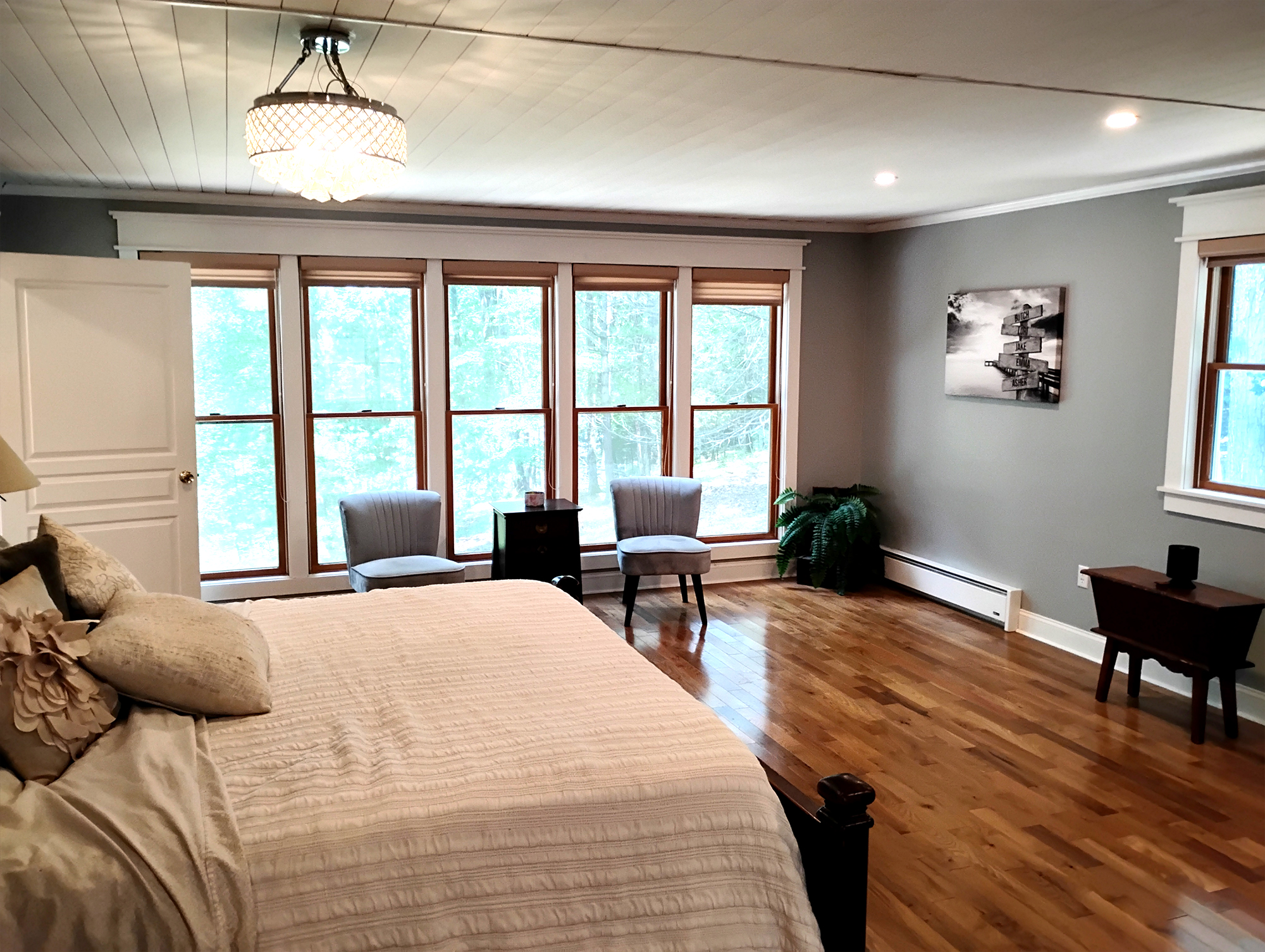
How NEPA Interior Painting effects mood. 


The colors you choose for your walls do more than decorate—they shape the way your home feels and how each room is experienced. Here in the Wilkes-Barre and Back Mountain area, we see every kind of space, from cozy lake homes around Harveys Lake to bright modern interiors in Dallas, Shavertown, and Clarks Summit. At House Painting Direct, we understand how a well-chosen color palette can make your home feel brighter, cozier, and more inviting.

Here’s how color influences mood and space—and how to choose tones that truly suit your Northeast Pennsylvania home.

house painting direct logo

 Cool Colors: Calm and Relaxation

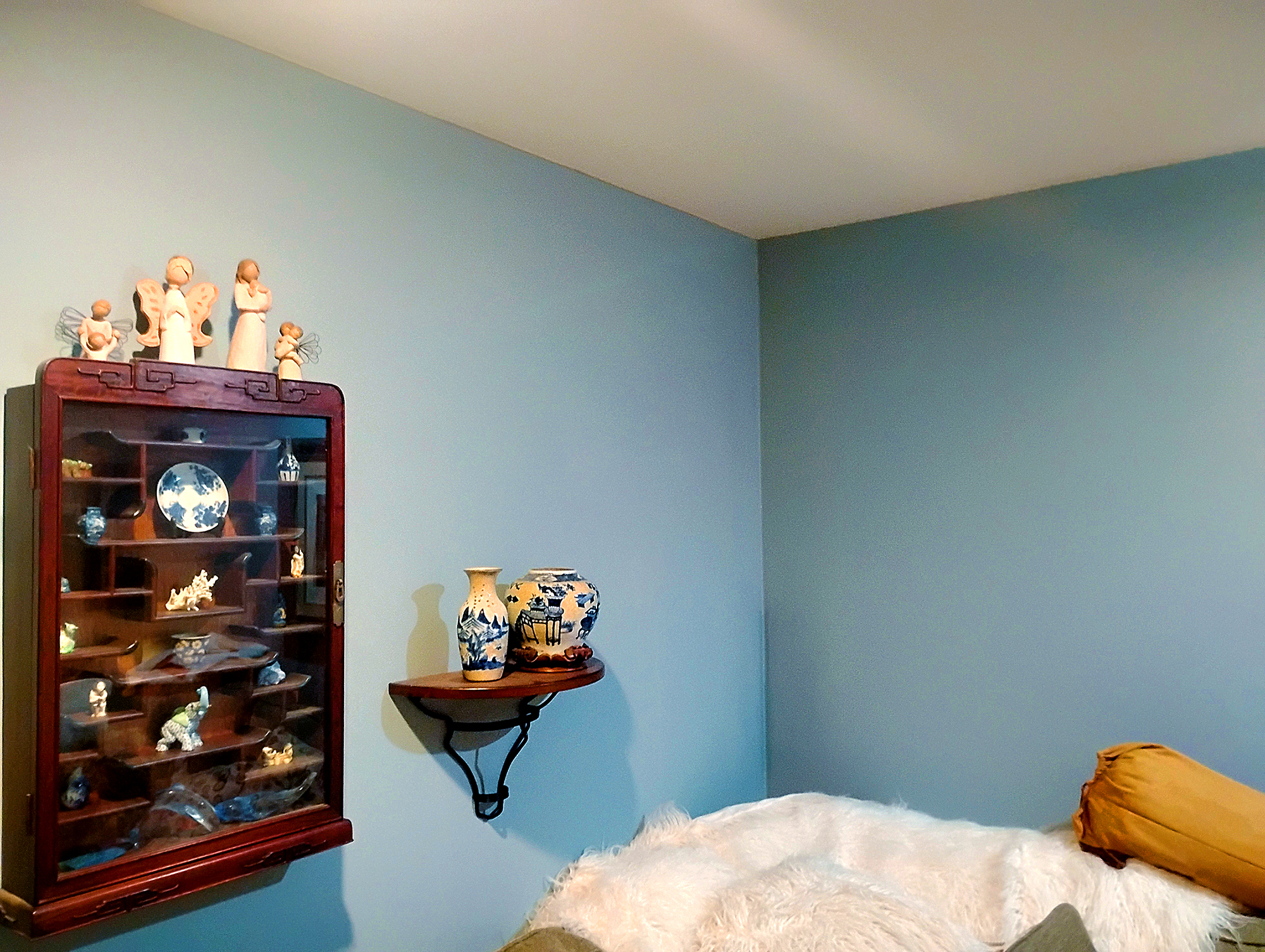
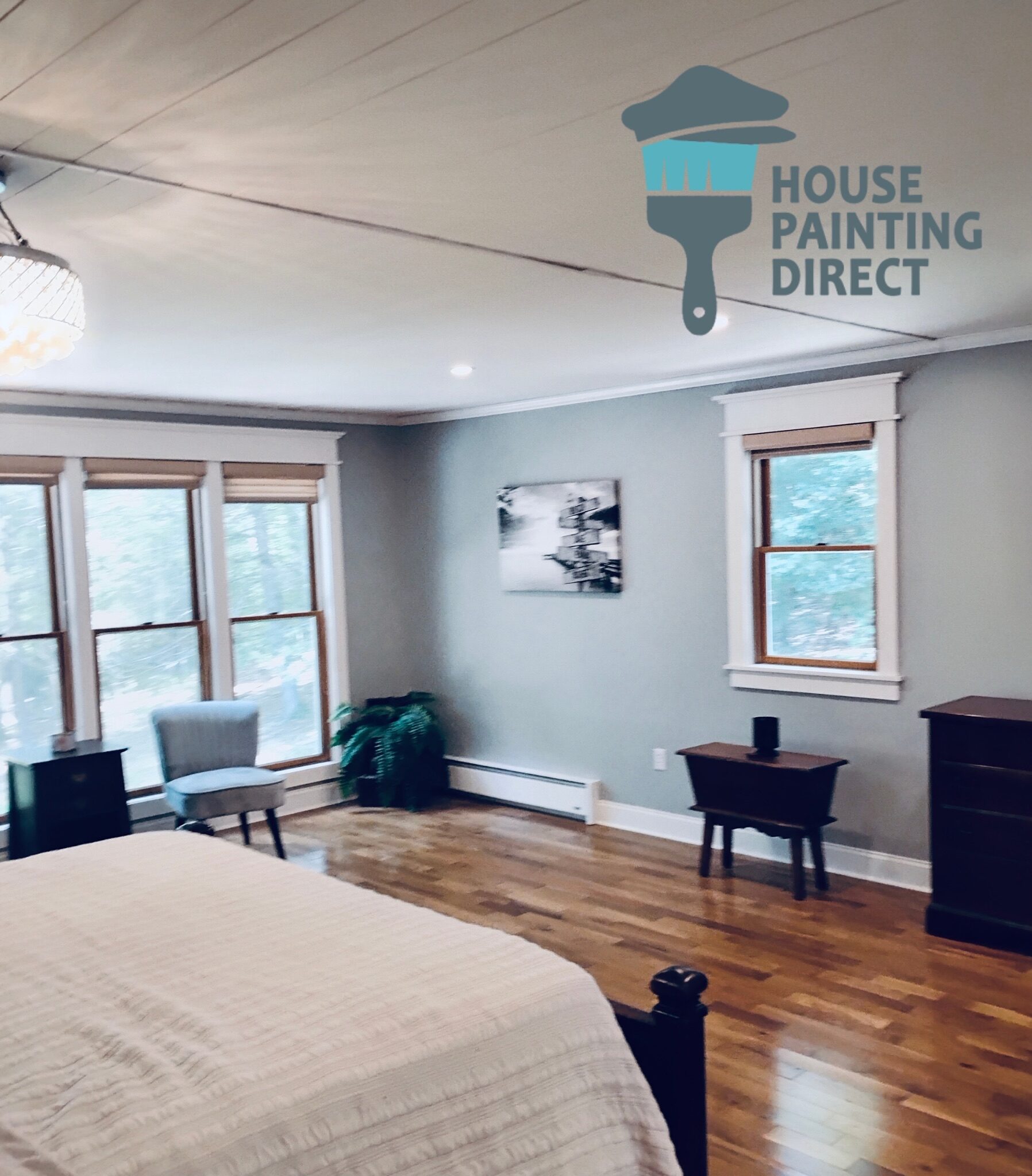
Cool hues like blue, green, and soft gray bring a sense of peace and quiet to a room. They’re perfect for bedrooms, bathrooms, or any space where you want to unwind — especially in the cozy homes and laid-back lake communities around Dallas, Shavertown, and Harveys Lake.

  • Blue promotes relaxation and serenity — ideal for bedrooms or living rooms where you want a softer, more restful mood.

  • Green represents balance and renewal, bringing the calm of NEPA’s forests and mountain views right indoors.

  • Gray adds sophistication and tranquility, especially when paired with warm accents to keep the room feeling inviting.

At House Painting Direct, we often recommend cool tones for homeowners across Wilkes-Barre, the Back Mountain, and Clarks Summit who want to create a spa-like, restorative atmosphere in their homes.
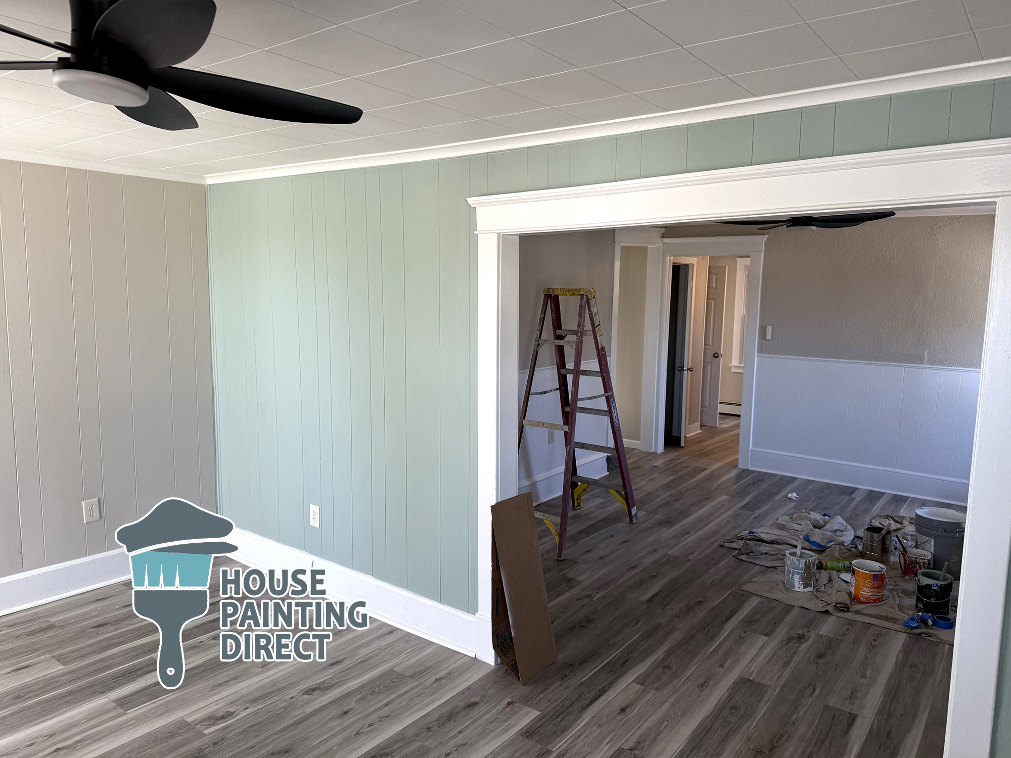
interior house painting pittston pa green walls and white trim ceiling paint
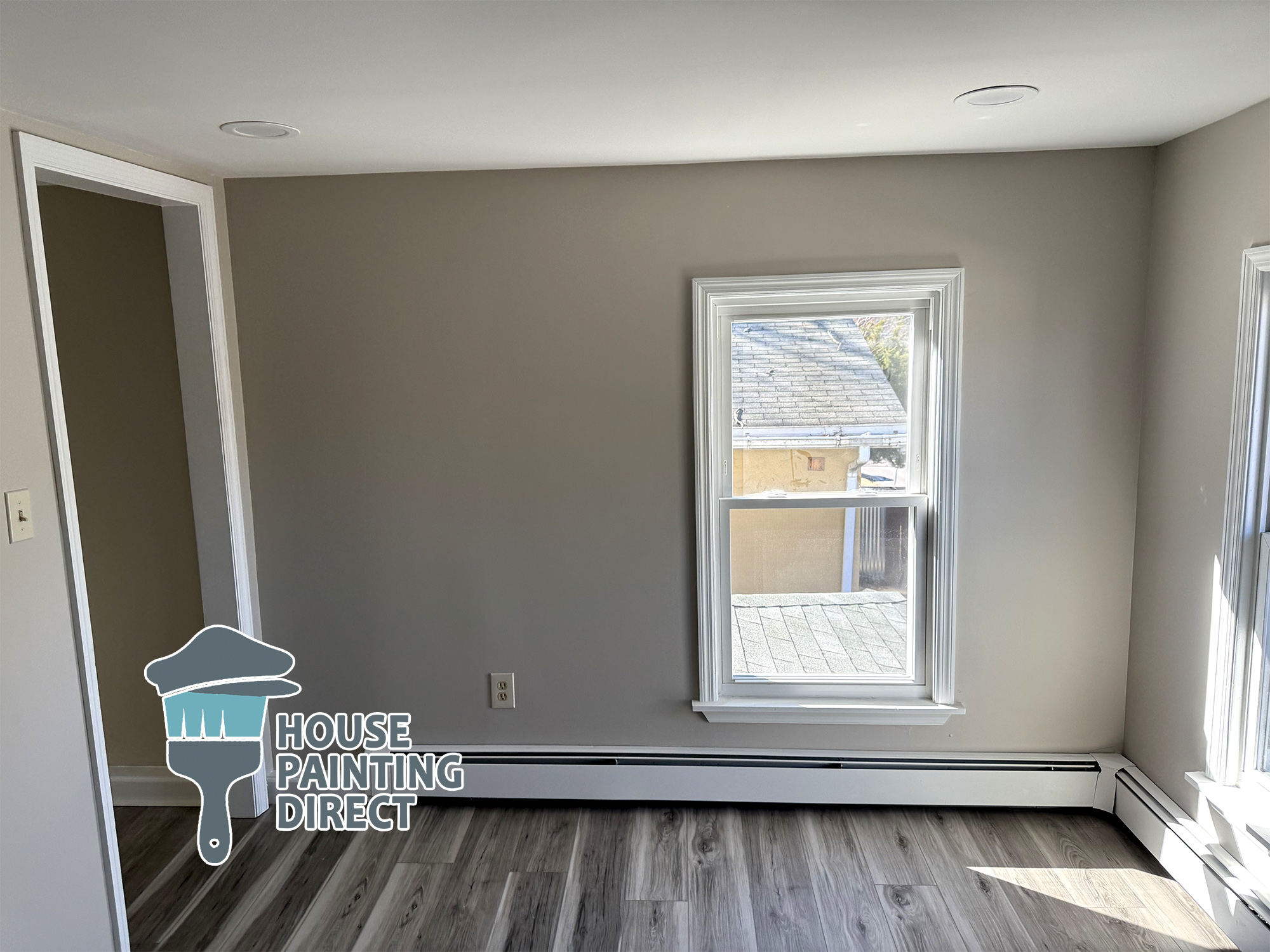
interior house painting wilkes-barre pa

Light Colors: Spacious and Airy

If your room feels small or a bit shadowed, light shades like white, beige, or pale pastels can instantly open up the space. These colors reflect light beautifully, creating a brighter, more uplifting atmosphere — a subtle shift that makes a noticeable difference in homes throughout Wilkes-Barre, Dallas, and the Back Mountain.

Light tones work especially well in:

  • Hallways that feel narrow or enclosed

  • Small bedrooms in older NEPA homes where natural light is limited

  • Lower-level spaces in Wilkes-Barre and Kingston where basements or partial basements can feel closed in

  • Lake cottages near Harveys Lake, where soft, airy palettes pair perfectly with natural light and water views

By choosing lighter colors, you allow the room to breathe. The walls recede visually, the space feels more open, and the entire room takes on a clean, airy vibe.

At House Painting Direct, we often recommend these tones for homeowners who want to brighten their space without the need for additional lighting or major renovations.

Dark Colors: Depth and Drama

Dark shades like navy, charcoal, and deep green bring a rich, elegant presence to a room. These tones create a grounded, sophisticated atmosphere and are especially effective in spaces where you want a sense of depth and personality.

Dark colors work beautifully in:

  • Larger living rooms where a bold tone can anchor the space

  • Dining rooms where deeper hues add warmth and intimacy

  • Accent walls, giving a room dimension without overwhelming it

  • Home offices or studies, where darker palettes create a calm, focused environment

When paired with thoughtful lighting and well-chosen décor, dark tones can feel luxurious and inviting — adding a touch of drama while still maintaining comfort.

We often use deeper colors to help homeowners achieve a refined, cozy mood that elevates the entire space.
Choosing the Right Palette for Your NEPA space

Every color tells a story—and your home should tell yours. Whether you want a relaxing retreat or a lively family space, choosing the right color palette is key.

Our team at House Painting Direct can help you find colors that fit your style, complement your home’s lighting, and enhance the feel of every room.

Refresh Your Home with Color and Style

A fresh coat of paint can completely transform your space—inside and out. Let House Painting Direct bring your vision to life with professional color consulting, quality finishes, and the kind of attention to detail that makes your home shine.

1 + 10 =