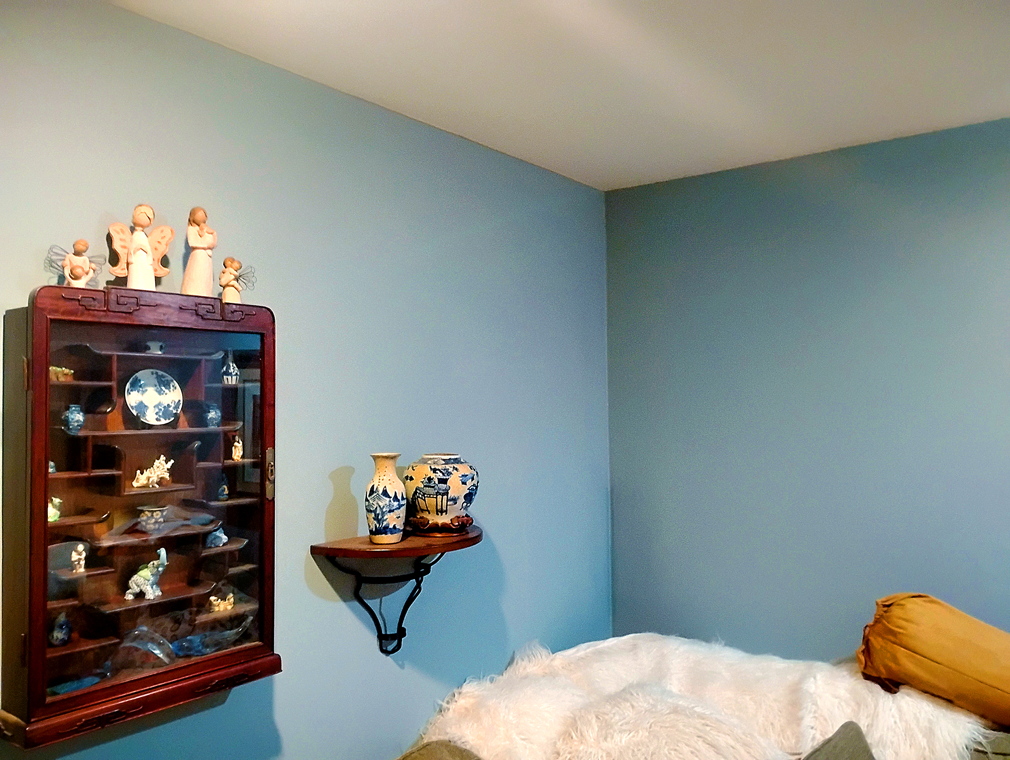
New Paint Job = New Home Value
If you live in one of Wilkes-Barre’s charming older homes, a fresh coat of paint can be one of the easiest and most cost-effective ways to boost your property’s value and curb appeal. A well-chosen color palette doesn’t just transform the look, it influences how your home is perceived, signals that it’s well-maintained, and even protects surfaces from the elements. Beyond the monetary benefits, a newly painted home simply feels fresher, brighter, and more inviting… both for you and for anyone who visits or views it.
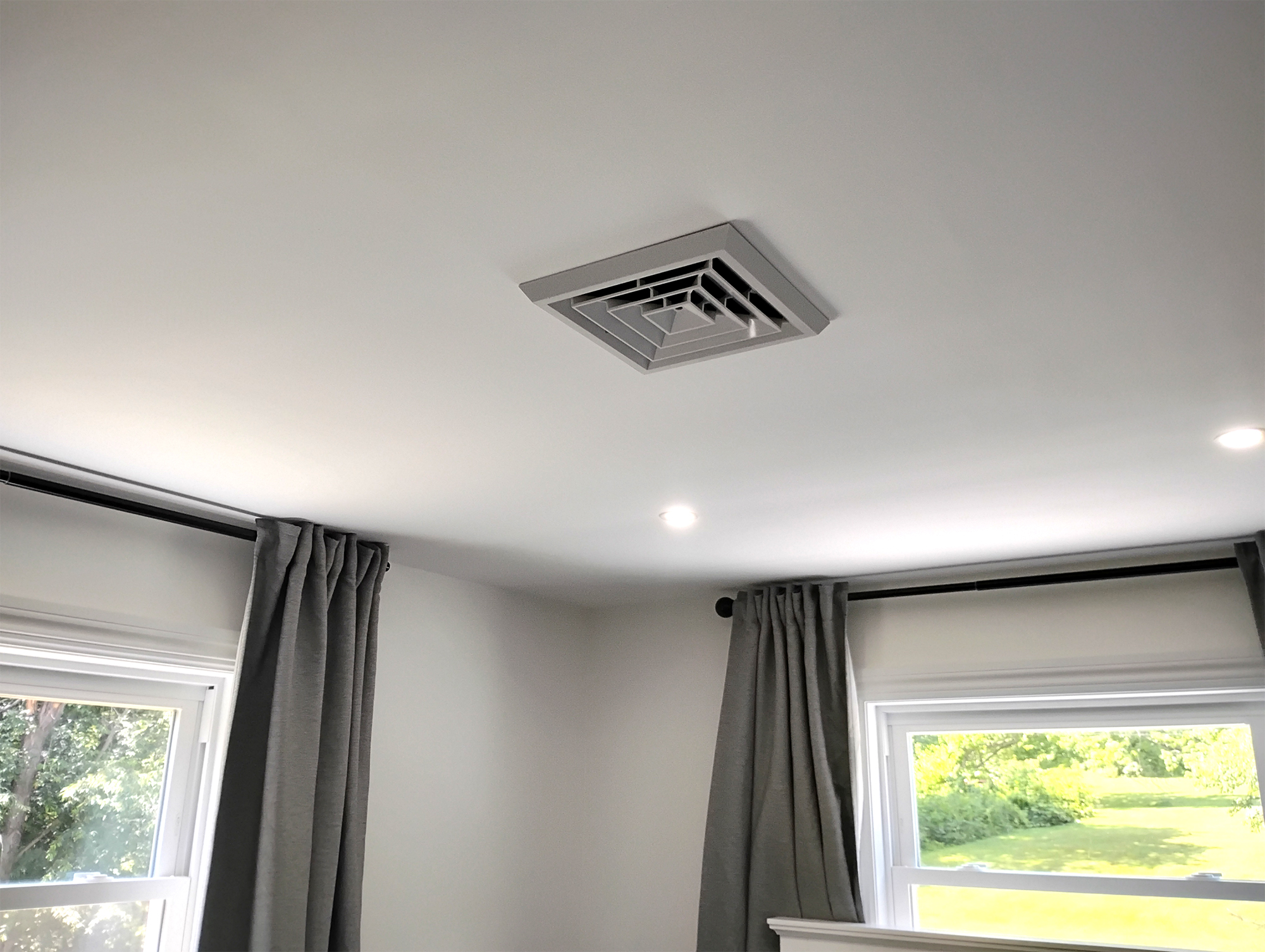
Instant Curb Appeal
First impressions matter. A freshly painted exterior gives your home a clean, well-cared-for look that immediately boosts curb appeal. Whether you’re selling or just want to impress the neighbors, clean lines and modern color choices make your home stand out in a positive way.
-
Higher Resale Potential – Homes with strong curb appeal often attract more buyers and command better offers.
-
Positive Neighborhood Impression – A well-kept exterior can elevate how your property is viewed within the community.
-
Standout Aesthetic – Fresh, modern colors help your home catch the eye in a competitive market.
-
Perceived Quality – A polished exterior signals that the home is cared for inside and out.
-
Faster Sales – Attractive homes often spend less time on the market.
Highlights Character Details
Older homes often have amazing architectural details—trim, molding, porches, and eaves—that get lost under old, peeling paint. Repainting can restore and highlight these historic features, showcasing your home’s original beauty.
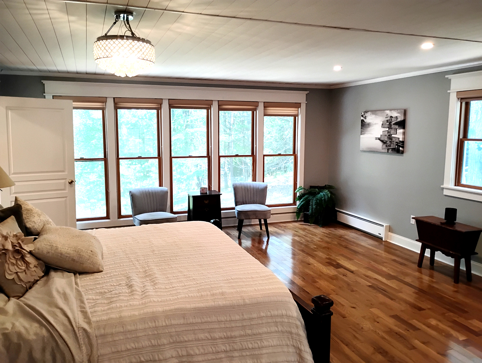
Protects Against NEPA Weather
Fresh exterior paint does more than improve appearance… it adds a vital layer of protection against rain, snow, wind, and sun, which is especially valuable in Northeastern PA’s unpredictable seasons. By sealing and shielding surfaces, it helps prevent wood rot, water intrusion, and long-term wear. A quality paint job can also reflect heat in the summer, retain warmth in the winter, and even contribute to lower heating and cooling costs. Over time, this protection not only preserves your home’s structure but also saves you money on repairs and energy bills.
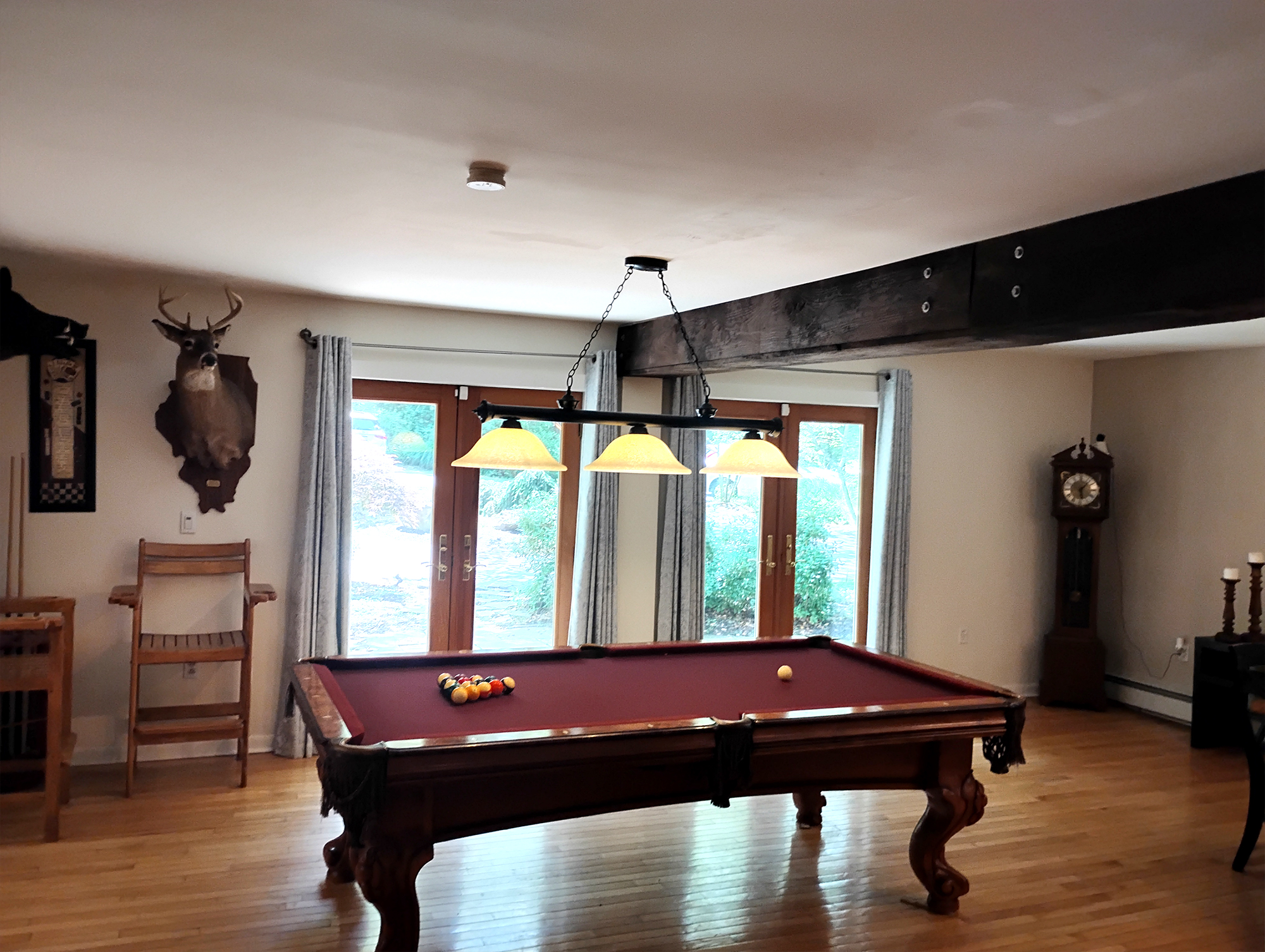
Adds Perceived and Appraised Value
Buyers notice fresh paint. Appraisers do too. A clean, modern color scheme inside and out suggests that the home is maintained, move-in ready, and worth a higher price. Studies show painting offers one of the best returns on investment for home improvement projects.
Creates a Modern, Cohesive Feel
- Neutral, On-Trend Colors – Warm grays, soft beiges, and creamy off-whites make a home feel fresh, clean, and move-in ready. Buyers often see neutral walls as less work—they won’t need to paint right away—and it’s easier for them to picture their own furniture in the space. Neutrals also help unify older floorplans, connecting rooms visually and making the home feel more open and harmonious.
- Bold or Dark Accent Colors – Deep navy, charcoal, or forest green can make a statement without overwhelming the space. They add depth and drama, perfect for highlighting fireplaces, built-ins, or unique architecture. For buyers, these touches can feel “designer” and high-end, which subtly increases perceived value—even if the rest of the home is simple. Darker tones can also create a cozy, intimate atmosphere in larger rooms.
- Earthy, Nature-Inspired Hues – Sage green, clay, terracotta, and warm browns bring a sense of comfort and stability. These colors resonate with buyers who value warmth, tradition, and connection to nature. In Northeastern PA, they also complement seasonal changes—feeling light and refreshing in summer while adding warmth and coziness in winter. Earth tones tend to age gracefully, so the home looks timeless rather than trendy.
- Light & Airy Pastels – Soft blues, muted lavenders, or pale yellows can make rooms feel cheerful and inviting. These colors appeal to buyers looking for a “happy” home environment and work especially well in kitchens, bathrooms, and children’s rooms. They also help smaller spaces feel brighter and more open.
Ready to See the Difference?
Painting your home—inside and out—is one of the fastest, most cost-effective ways to add real value. If your Wilkes-Barre home is starting to show its age, start with a brush and a bold new color. You’ll be amazed at the transformation… and so will everyone who sees it.

Contact Us For Your Free Estimate Today!
Painting your home—inside and out—is one of the fastest, most cost-effective ways to add real value.r_left” background_horizontal_offset=”-3%” module_alignment=”center” global_colors_info=”{}”]
New Paint Job = New Home Value
If you live in one of Wilkes-Barre’s charming older homes, a fresh coat of paint can be one of the easiest and most cost-effective ways to boost your property’s value and curb appeal. A well-chosen color palette doesn’t just transform the look, it influences how your home is perceived, signals that it’s well-maintained, and even protects surfaces from the elements. Beyond the monetary benefits, a newly painted home simply feels fresher, brighter, and more inviting… both for you and for anyone who visits or views it.
Instant Curb Appeal
First impressions matter. A freshly painted exterior gives your home a clean, well-cared-for look that immediately boosts curb appeal. Whether you’re selling or just want to impress the neighbors, clean lines and modern color choices make your home stand out in a positive way.
-
Higher Resale Potential – Homes with strong curb appeal often attract more buyers and command better offers.
-
Positive Neighborhood Impression – A well-kept exterior can elevate how your property is viewed within the community.
-
Standout Aesthetic – Fresh, modern colors help your home catch the eye in a competitive market.
-
Perceived Quality – A polished exterior signals that the home is cared for inside and out.
-
Faster Sales – Attractive homes often spend less time on the market.
Highlights Character Details
Older homes often have amazing architectural details—trim, molding, porches, and eaves—that get lost under old, peeling paint. Repainting can restore and highlight these historic features, showcasing your home’s original beauty.
Protects Against NEPA Weather
Fresh exterior paint does more than improve appearance… it adds a vital layer of protection against rain, snow, wind, and sun, which is especially valuable in Northeastern PA’s unpredictable seasons. By sealing and shielding surfaces, it helps prevent wood rot, water intrusion, and long-term wear. A quality paint job can also reflect heat in the summer, retain warmth in the winter, and even contribute to lower heating and cooling costs. Over time, this protection not only preserves your home’s structure but also saves you money on repairs and energy bills.
Adds Perceived and Appraised Value
Buyers notice fresh paint. Appraisers do too. A clean, modern color scheme inside and out suggests that the home is maintained, move-in ready, and worth a higher price. Studies show painting offers one of the best returns on investment for home improvement projects.
Creates a Modern, Cohesive Feel
- Neutral, On-Trend Colors – Warm grays, soft beiges, and creamy off-whites make a home feel fresh, clean, and move-in ready. Buyers often see neutral walls as less work—they won’t need to paint right away—and it’s easier for them to picture their own furniture in the space. Neutrals also help unify older floorplans, connecting rooms visually and making the home feel more open and harmonious.
- Bold or Dark Accent Colors – Deep navy, charcoal, or forest green can make a statement without overwhelming the space. They add depth and drama, perfect for highlighting fireplaces, built-ins, or unique architecture. For buyers, these touches can feel “designer” and high-end, which subtly increases perceived value—even if the rest of the home is simple. Darker tones can also create a cozy, intimate atmosphere in larger rooms.
- Earthy, Nature-Inspired Hues – Sage green, clay, terracotta, and warm browns bring a sense of comfort and stability. These colors resonate with buyers who value warmth, tradition, and connection to nature. In Northeastern PA, they also complement seasonal changes—feeling light and refreshing in summer while adding warmth and coziness in winter. Earth tones tend to age gracefully, so the home looks timeless rather than trendy.
- Light & Airy Pastels – Soft blues, muted lavenders, or pale yellows can make rooms feel cheerful and inviting. These colors appeal to buyers looking for a “happy” home environment and work especially well in kitchens, bathrooms, and children’s rooms. They also help smaller spaces feel brighter and more open.
Ready to See the Difference?
Painting your home—inside and out—is one of the fastest, most cost-effective ways to add real value. If your Wilkes-Barre home is starting to show its age, start with a brush and a bold new color. You’ll be amazed at the transformation… and so will everyone who sees it.