
Be Beautiful

How Paint Color Affects Home Value

Interior & Exterior Painting Tips, Tricks and Local NEPA Stories

Small Color Choices Make a Big Difference

When homeowners think about boosting curb appeal, they often focus on the primary exterior paint color. While that color certainly sets the overall tone, it’s often the accent colors that give a home its personality.

Accent colors highlight architectural features, create visual interest, and help a home feel polished rather than plain. Whether it’s a bold front door, contrasting shutters, or carefully selected trim, these thoughtful details can transform the overall appearance without overwhelming the design.

Across Wilkes-Barre, Scranton, Dallas, Clarks Summit, Harveys Lake, Mountain Top, White Haven, and the wooded communities throughout the Poconos, homes come in many architectural styles. The right accent colors allow each property to express its unique character while complementing the natural beauty of Northeastern Pennsylvania.

What Are Exterior Accent Colors?

Accent colors are secondary colors used to emphasize specific architectural elements rather than covering the home’s main surfaces.

Common areas for accent colors include:

  • Front doors
  • Window shutters
  • Decorative trim
  • Porch ceilings
  • Columns
  • Garage doors
  • Window boxes
  • Railings
  • Gable details
  • Decorative brackets

These accents help break up large expanses of siding while drawing attention to the home’s best features.

Why Accent Colors Matter

Color naturally guides the eye.

Without accents, a home can appear flat or one-dimensional, even if the primary paint color is beautiful.

Well-placed accent colors can:

  • Highlight architectural details
  • Add depth and dimension
  • Create stronger visual balance
  • Make the entryway more inviting
  • Enhance perceived craftsmanship
  • Help distinguish the home from neighboring properties

The goal isn’t to use more color—it’s to use color with intention.

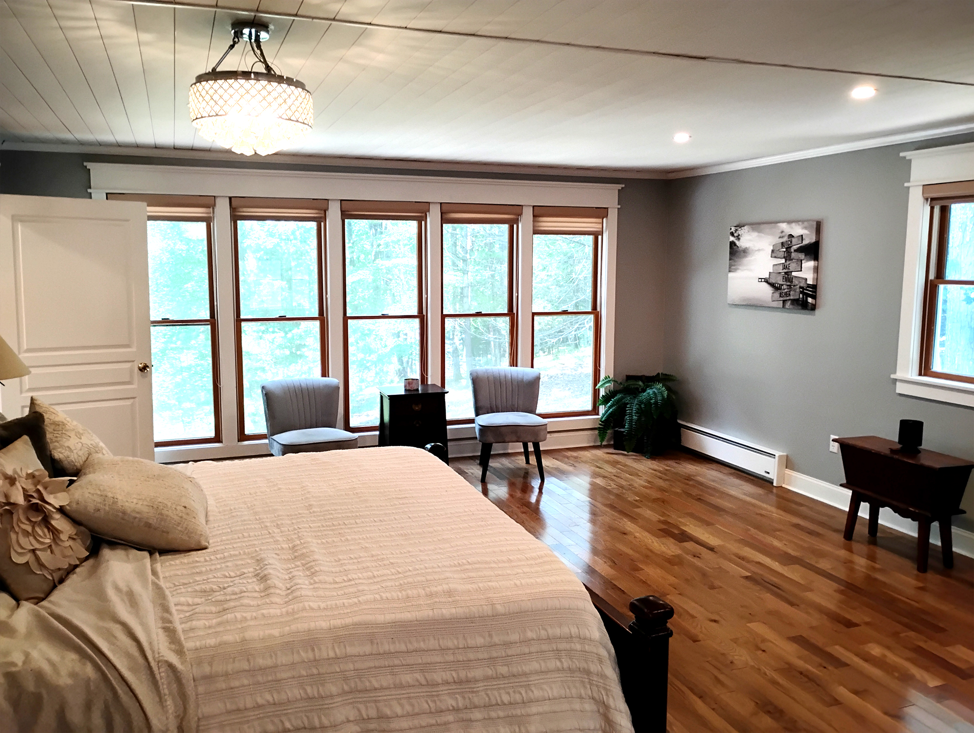
interior living room painting modern luzerne county

The Front Door Is Often the Perfect Starting Point

The front door is one of the most effective places to introduce an accent color.

Because it’s the focal point of the home’s entrance, a carefully selected door color naturally welcomes visitors while adding personality.

Popular accent choices include:

  • Deep navy
  • Forest green
  • Rich burgundy
  • Charcoal black
  • Warm red
  • Slate blue
  • Soft teal
  • Natural wood finishes

The best choice depends on the home’s architecture, surrounding landscape, and existing color palette.

Nature Can Inspire Your Color Palette

One advantage of living throughout NEPA is the remarkable variety of natural landscapes.

Homes may overlook:

  • Forests
  • Lakes
  • Rolling hills
  • Stone walls
  • Mountain views
  • Mature hardwood trees

Drawing inspiration from these surroundings often creates a harmonious exterior.

Popular nature-inspired accent colors include:

  • Evergreen
  • Moss green
  • Deep blue
  • Warm bronze
  • Charcoal
  • Weathered gray
  • Rich brown
  • Soft clay tones

These colors complement Pennsylvania’s changing seasons while remaining timeless throughout the year.

Don’t Overlook Garage Doors and Shutters

Many homeowners focus exclusively on the front door, but other features contribute significantly to curb appeal.

Garage doors, particularly on front-facing garages, occupy a large portion of the home’s exterior.

Similarly, shutters can either blend quietly into the design or provide tasteful visual interest.

Rather than selecting these colors independently, it’s helpful to think of them as part of a coordinated exterior palette.

Accent Colors Can Highlight Craftsmanship

One of the greatest strengths of accent colors is their ability to showcase architectural details that might otherwise go unnoticed.

For example:

  • Decorative window trim
  • Crown moldings
  • Porch columns
  • Corbels
  • Gable brackets
  • Dentil molding
  • Railings

Subtle contrast helps these features stand out without making the home appear overly busy.

This is particularly valuable for many historic homes throughout Wilkes-Barre and Scranton, where original craftsmanship deserves attention.

A Thoughtful Palette Creates Lasting Appeal

Curb appeal is rarely the result of one dramatic design decision. Instead, it’s built through a series of thoughtful choices that work together. Accent colors are one of the most effective ways to enhance a home’s appearance because they draw attention to its finest architectural features without overwhelming the overall design.

Whether you’re refreshing a traditional home in Shavertown, updating a mountain retreat near White Haven, or painting a lakeside property in Harveys Lake, carefully selected accent colors can elevate the entire exterior. By complementing the home’s architecture, reflecting the surrounding landscape, and creating balanced visual contrast, these finishing touches help create an exterior that feels welcoming, refined, and beautifully suited to the character of Northeastern Pennsylvania.

6 + 3 =

Color Is More Than Just Aesthetic

When it comes to home value in Northeastern Pennsylvania, paint color is far more than a cosmetic choice. Whether your home sits on a quiet street in Dallas or a wooded lot near Harveys Lake, the exterior color palette influences first impressions, perceived upkeep, and overall desirability.

Buyers — and appraisers — notice subtle details like color harmony, contrast, and context. A well-chosen paint palette can make a home feel larger, more modern, or more inviting, while a mismatched or outdated color scheme can unintentionally signal neglect. In NEPA’s mix of historic neighborhoods, modern suburbs, and rural retreats, color choices need to reflect both architectural style and regional context.

The Psychological Effect of Color on Perceived Value

Color subtly communicates character and care.

  • Warm neutrals (soft taupes, greiges, cream) convey reliability and timelessness. Buyers often perceive these homes as well-maintained and move-in ready.
  • Cool shades (gray, blue, or soft greens) can evoke sophistication and a modern aesthetic, appealing to buyers seeking contemporary finishes.
  • Bold accents (navy doors, deep red shutters, or forest green trim) draw attention to architectural features, but when overused, can make a home feel aggressive or out of place.

The psychological impact of color can affect offers, sometimes adding perceived value even when the structure itself hasn’t changed.

Harmonizing with Neighborhood Context

NEPA is diverse in architecture and landscape, from historic Scranton row homes to mountain retreats in the Poconos. Paint color that clashes with surroundings can lower perceived value, while a palette that complements local materials, seasonal foliage, and roof tones can enhance it.

Examples of Neighborhood Harmony

  • Historic homes in Wilkes-Barre: Muted cream, warm gray, or soft sage preserve charm and appeal to buyers who value period authenticity.
  • Mountain homes near Mountain Top: Deeper earthy tones (forest green, charcoal, rustic brown) blend naturally with pines and stonework, enhancing perceived cohesion.
  • Suburban homes in Clarks Summit or Dallas: Soft neutral exteriors with contrasting white or black trim offer polished, move-in-ready appeal.

Harmonious color schemes help a property feel “finished,” suggesting careful maintenance and higher quality.

Color and Curb Appeal: First Impressions Matter

Studies show buyers form opinions within seconds of seeing a home’s exterior. Paint color contributes heavily to these impressions.

  • Light, bright exteriors often make homes feel larger and more welcoming, improving curb appeal in tighter urban settings or shaded streets.
  • Darker, richer tones can add sophistication, especially when paired with natural stone, wood accents, or evergreen landscaping.
  • Accents like doors, shutters, and trim can define architectural features, subtly increasing perceived value when executed thoughtfully.

A mismatched or outdated palette, by contrast, may create the opposite effect, making even well-maintained homes feel less desirable.

 Light vs. Dark Exteriors

Light Colors

Bright exteriors can make small lots or shaded streets feel more open. They suggest cleanliness, freshness, and attention to detail, which buyers notice immediately.

Dark Colors

Deep exteriors work well in wooded or upscale areas, emphasizing elegance and blending naturally with stone and forested surroundings. The key is balancing dark siding with lighter trim or warm accents to avoid visual heaviness.
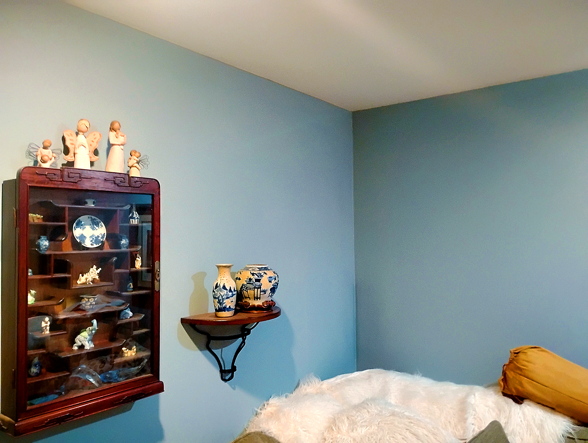
Interior Paint Residential Kingston PA blue on white ceiling web

Aligning Color with Architecture

Paint color should reinforce, not obscure, the home’s architecture.

  • Colonial or traditional homes: Soft whites, taupes, and muted blues highlight symmetry and classical details.
  • Modern or transitional homes: Charcoal, gray, and sophisticated neutrals highlight clean lines and large windows.

Cabins and cottages: Earthy greens, browns, and warm grays allow the home to integrate with natural surroundings.

Conclusion: Thoughtful Color Choices Pay Dividends

Paint color influences perceived value in ways both immediate and subtle. From first impressions at the curb to the subconscious cues buyers pick up inside, color communicates care, style, and harmony. In NEPA, where seasonal shifts and regional landscapes add visual complexity, the right exterior and interior palettes can enhance home value, curb appeal, and overall desirability.

Ultimately, selecting color thoughtfully — aligned with architecture, setting, and buyer expectations — transforms a simple paint update into a strategic investment in your home’s market appeal.


6 + 11 =