Be Beautiful

How to Give Your Old Luzerne County Cabin a Fresh New Look With Paint

Interior & Exterior Painting Tips, Tricks and Local NEPA Stories

Let the Masonry Lead

Stone and brick give a home something paint alone cannot: texture, permanence, and natural variation. They can make a property feel established and connected to its surroundings, particularly in Northeastern Pennsylvania, where older homes often combine masonry with painted siding, trim, shutters, porches, and other architectural details.

But those same qualities can make exterior color selection more complicated.

Stone and brick are rarely one flat color. A single wall may contain several shades of gray, brown, tan, red, cream, or even subtle blue and green undertones. Choosing a paint color that looks attractive on a small sample can therefore produce a very different result once it is placed beside the masonry.

The best approach is usually not to find a paint color that matches the brick or stone.

Instead, find one that works with it.

For homeowners in Wilkes-Barre, Scranton, Dallas, Shavertown, Mountain Top, White Haven, and the surrounding Poconos, this distinction can make all the difference between an exterior that feels naturally coordinated and one where the painted areas seem disconnected from the masonry.

What Is an Accent Color on a Home Exterior?

The Difference Between Matching and Coordinating

Trying to match brick or stone exactly is often unnecessary — and sometimes impossible.

Natural masonry contains too much variation for a single paint color to reproduce it accurately.

Coordination is a better strategy.

For example, if your stone contains warm gray, cream, and brown tones, a soft greige may coordinate beautifully without looking like an attempt to imitate the stone.

Likewise, if your brick has deep red and brown tones, a muted green or warm charcoal can provide contrast while still feeling connected to the masonry.

Think of the exterior as a palette rather than a collection of separate materials.

Why Accent Colors Affect Curb Appeal

A home exterior is something people typically see from a distance before they notice individual details.

The primary siding or exterior color establishes the overall impression. Accent colors then help the eye understand where to look.

A darker front door can make the entryway feel more prominent. Contrasting shutters can frame windows. A carefully selected trim color can emphasize rooflines, dormers, or other architectural features.

In design terms, contrast creates visual hierarchy.

Instead of every exterior element receiving equal attention, the accent color tells the eye which features deserve emphasis.

That can make an otherwise plain exterior feel more architectural and considered.

Choosing White Paint Around Brick and Stone

White is one of the most popular exterior paint choices, but “white” is not one color.

Some whites have strong yellow undertones. Others lean gray, blue, cream, or beige.

This becomes especially noticeable beside masonry.

A bright, cool white may look crisp beside cool gray stone but can appear harsh next to warm red brick.

A softer warm white may blend beautifully with traditional brick but look yellow against certain cool-toned stones.

Before selecting white exterior paint, examine the masonry in natural light.

A white sample should be tested directly against the brick or stone whenever possible.

Consider the Roof, Too

Brick and stone are not the only permanent materials affecting exterior color.

The roof is another major visual element that typically remains in place for many years.

If the home has a dark charcoal roof, for example, a warm tan exterior may need different supporting colors than it would with a brown roof.

Consider the relationship between:

Masonry + Roof + Paint + Trim + Landscaping

These elements do not need to match.

They need to make sense together.

A home with red brick, a dark gray roof, cream trim, and muted green shutters can have significantly more visual depth than one where every element is painted a similar shade.

Consider the Roof, Too

Brick and stone are not the only permanent materials affecting exterior color.

The roof is another major visual element that typically remains in place for many years.

If the home has a dark charcoal roof, for example, a warm tan exterior may need different supporting colors than it would with a brown roof.

Consider the relationship between:

Masonry + Roof + Paint + Trim + Landscaping

These elements do not need to match.

They need to make sense together.

A home with red brick, a dark gray roof, cream trim, and muted green shutters can have significantly more visual depth than one where every element is painted a similar shade.

Accent Colors Should Support the Masonry

Once the main paint color has been selected, accent colors can provide another layer of definition.

Common accent areas include:

  • Front doors
  • Shutters
  • Garage doors
  • Porch railings
  • Window trim
  • Gables
  • Architectural details

The accent color can pick up a subtle tone from the brick or stone.

For example, a stone facade containing small amounts of dark charcoal might provide the inspiration for a charcoal front door.

A brick exterior with subtle dark brown tones might pair beautifully with a deep brown or muted green accent.

This creates a visual connection without making the entire exterior look overly coordinated.

Don’t Ignore Mortar Color

One detail homeowners sometimes overlook is the mortar between bricks or stones.

Mortar can have a surprisingly strong influence on how the masonry appears from a distance.

Light mortar can make brickwork appear brighter and softer. Darker mortar can emphasize individual bricks and create stronger contrast.

That means the overall appearance of the masonry is not determined by the brick or stone itself.

When selecting paint, consider the mortar as part of the visual field.

A warm white exterior may relate beautifully to light mortar, while a cooler gray could create a more contemporary contrast.

Color Choices for Wooded Homes in the Poconos

Homes in wooded areas have a particularly rich backdrop.

Instead of treating the trees as a challenge, use them as part of the color selection process.

Deep greens, natural grays, muted taupes, warm creams, and earthy neutrals can create a strong relationship between the home and its surroundings.

For a property surrounded by mature trees, a very bright exterior may create dramatic contrast. That can be beautiful, but it should be intentional.

A softer palette can create a quieter, more integrated appearance.

There is no requirement that a house in the woods look rustic.

A sophisticated neutral palette can feel just as appropriate while giving the property a polished presence.

The Bottom Line

Brick and stone give a home a head start when it comes to character. The right paint color should preserve that character while creating a cohesive relationship between masonry, siding, trim, roofing, and the surrounding landscape.

The most successful exterior palettes do not try to make every material look the same.

They let each material do its job.

Brick can provide warmth and texture. Stone can provide natural variation and permanence. Paint can frame those materials, highlight architecture, and introduce just enough contrast to make the entire exterior feel finished.

For homes throughout NEPA — from established neighborhoods around Wilkes-Barre to wooded properties near Harveys Lake and the Poconos — the surrounding environment is part of the design.

Start with what is already there.

Study the brick. Look closely at the stone. Notice the roof, mortar, landscaping, and natural light. Then choose paint colors that support those elements rather than fighting them.

3 + 8 =

Owning a cabin in Luzerne County means you get to enjoy the quiet beauty of northeastern Pennsylvania year-round. Whether your place sits near the shoreline of Harveys Lake or is tucked into the wooded hills outside Wilkes-Barre, your cabin likely holds years of memories—and maybe a few signs of aging, too. The good news is that a fresh coat of paint can completely transform the look and feel of your property without taking away its rustic charm.

Start With a Careful Inspection

Before choosing colors or buying supplies, take time to evaluate your cabin’s current condition. Walk around the exterior and pay close attention to peeling paint, cracked siding, soft or rotting wood, and any areas where moisture may have collected. Cabins located near wooded trails or close to natural attractions like Ricketts Glen State Park often deal with extra humidity, which can lead to mildew and surface deterioration.

If you find damaged boards or trim, replace or repair them first. Paint is designed to protect solid surfaces, not hide structural problems. Taking care of repairs now will make your paint job last significantly longer.
Choose Colors That Complement the Landscape

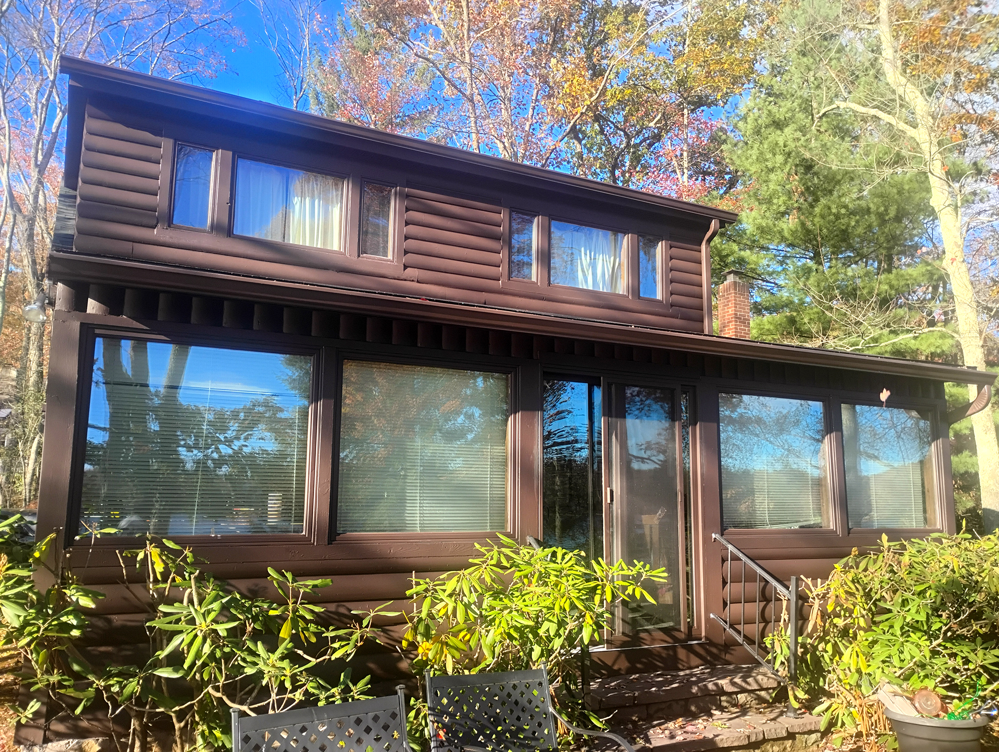
One of the most important decisions in updating your cabin is selecting the right color scheme. In Luzerne County, nature provides plenty of inspiration. Earthy tones like cedar brown, forest green, slate gray, and deep navy blend beautifully with the surrounding trees and rolling hills. If your cabin is part of the greater Pocono Mountains region, consider how your color choice will look during all four seasons—especially during fall when foliage becomes vibrant and bold.

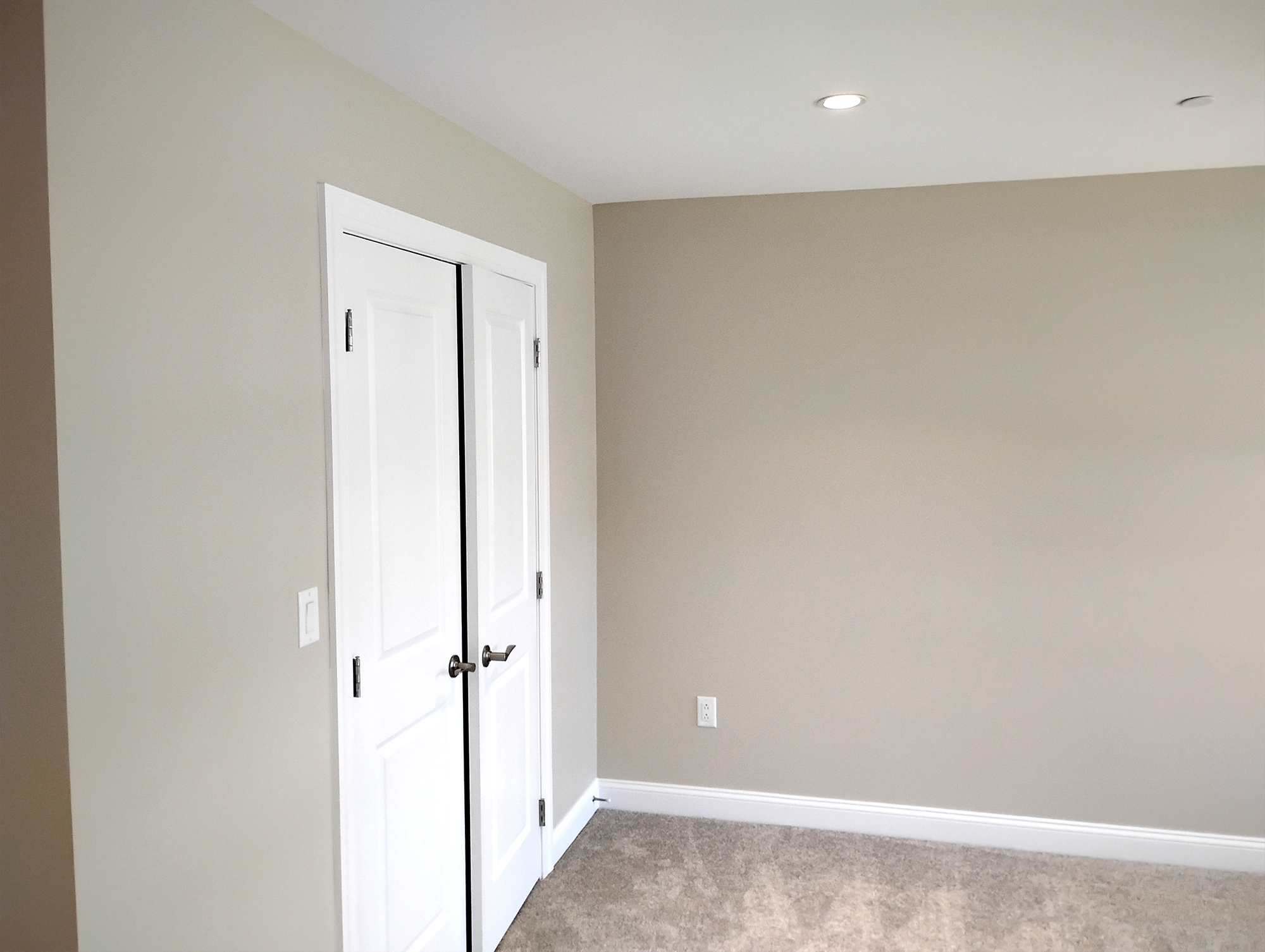
For interiors, lighter neutral shades can open up smaller rooms and make your cabin feel more spacious while still maintaining warmth. A single accent wall behind a fireplace or in a living area can add character without overwhelming the space.

Preparation Is Key in Pennsylvania’s Climate

Luzerne County’s weather can be unpredictable, with humid summers and freezing winters. Proper preparation is what separates a short-term refresh from a long-lasting upgrade. Start by power washing the exterior to remove dirt, pollen, and mildew buildup. After the surface dries completely, scrape away loose paint and sand rough patches to create a smooth base.

Applying a quality primer is especially important if your cabin has exposed or older wood siding. Primer seals the surface, improves adhesion, and provides a consistent foundation for the final color. Sealing gaps and cracks with caulk will also help prevent moisture from seeping in once winter arrives.
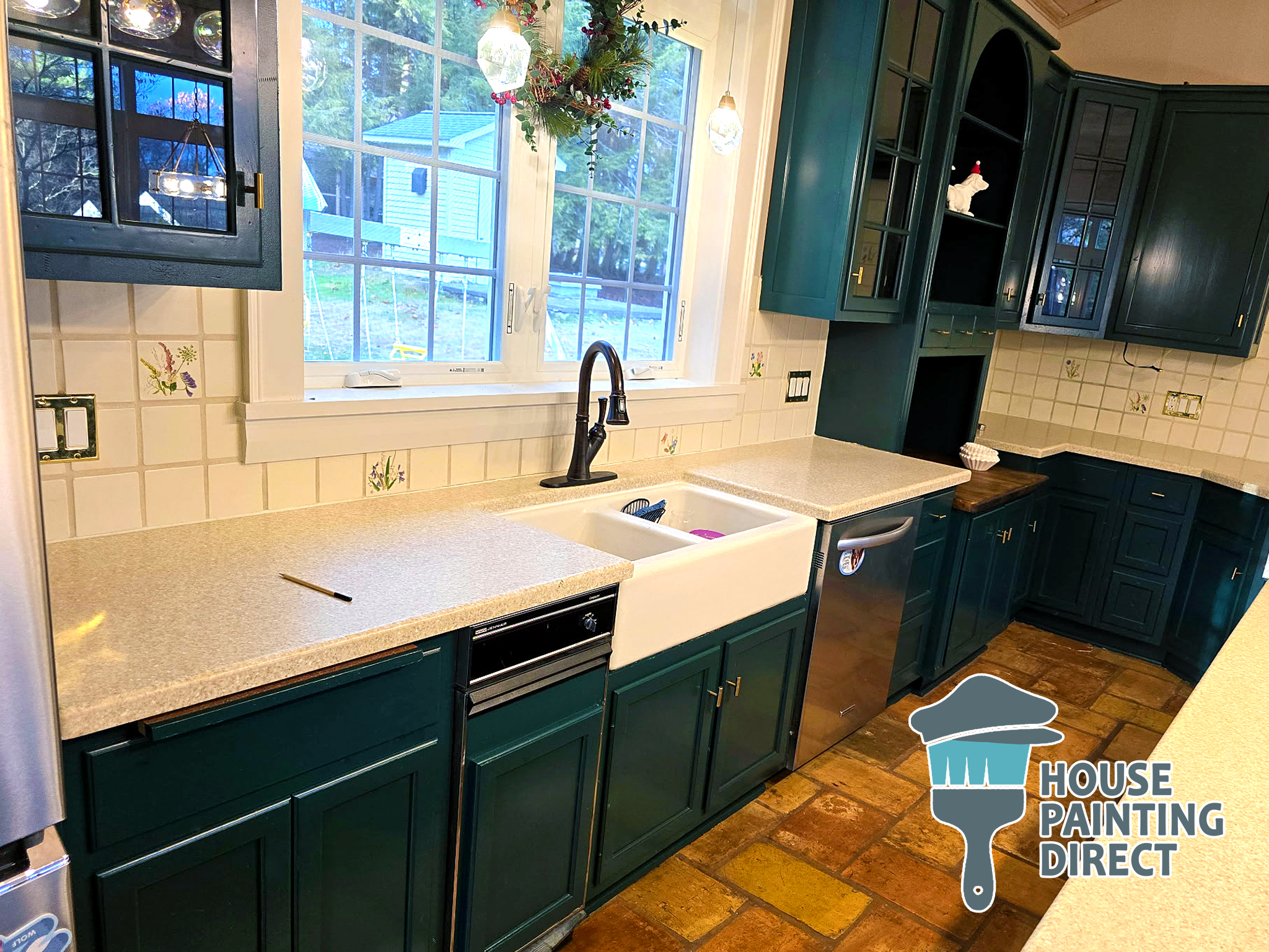
Green Cabinet Painting Residential House Painting Kitchen Cabinet Dallas PA

Preparation Is Key in Pennsylvania’s Climate

Luzerne County’s weather can be unpredictable, with humid summers and freezing winters. Proper preparation is what separates a short-term refresh from a long-lasting upgrade. Start by power washing the exterior to remove dirt, pollen, and mildew buildup. After the surface dries completely, scrape away loose paint and sand rough patches to create a smooth base.

Applying a quality primer is especially important if your cabin has exposed or older wood siding. Primer seals the surface, improves adhesion, and provides a consistent foundation for the final color. Sealing gaps and cracks with caulk will also help prevent moisture from seeping in once winter arrives.

Select Paint Built for the Elements

Not all paint performs well in northeastern Pennsylvania’s freeze-thaw cycles. Invest in high-quality exterior latex paint that offers mildew resistance and UV protection. These features will help your cabin maintain its color and durability through heavy rain, snow, and sun exposure.

For trim, doors, and railings, a semi-gloss finish is often the best choice. It resists moisture and is easier to clean, making it ideal for high-contact areas.

Focus on High-Impact Details

If a full exterior repaint feels overwhelming, you can still achieve a noticeable transformation by concentrating on key areas. Updating the front door with a bold color, refreshing window trim, or repainting shutters can instantly modernize your cabin’s appearance. Even small upgrades can create strong curb appeal and make the property feel well cared for.

Inside, repainting cabinets or brightening ceilings can dramatically improve the atmosphere without requiring a complete renovation.

Time Your Project for Best Results

In Luzerne County, late spring through early fall typically offers the best painting conditions. Avoid working in extreme heat, high humidity, or temperatures below 50 degrees. Choosing the right window of weather allows the paint to cure properly and increases its lifespan.


A Fresh Look Without Losing Character

Your Luzerne County cabin tells a story—of family gatherings, quiet mornings, and weekends spent outdoors. A thoughtfully planned paint update protects that story while giving your property renewed life. By preparing surfaces carefully, selecting colors that complement the local landscape, and using weather-resistant products, you can ensure your cabin remains beautiful and protected for years to come.

If you’d like, I can also tailor this article specifically for your painting business website with stronger local SEO and a call-to-action for Luzerne County homeowners.

8 + 14 =