
The Right Choice Has Less to Do With Trend and More to Do With Atmosphere
A lot of homeowners approach paint color like there are two opposing teams:
- light paint makes rooms feel bigger,
- dark paint makes rooms feel smaller.
That’s technically true in the simplest sense, but it leaves out almost everything that actually matters in a lived-in home.
Because the best color choice is not really about size.
It’s about feeling.
Some spaces become brighter, calmer, and more open with lighter tones. Others feel dramatically more sophisticated and comfortable when darker colors bring depth to the room.
And throughout NEPA — from older homes in Scranton to wooded properties near Harveys Lake or Mountain Top — lighting conditions vary so much that the same paint color can behave completely differently from one home to the next.
That’s why choosing between light and dark paint is less about rules and more about understanding what the room is trying to become.
Light Paint Reflects More Than Just Light
Lighter paint colors naturally bounce illumination around the room.
That’s why they’re commonly used in:
- smaller bedrooms,
- hallways,
- lower-level spaces,
- and homes with limited natural sunlight.
But beyond brightness, lighter colors also create psychological openness. Rooms feel calmer, cleaner, and visually quieter.
This becomes especially useful during NEPA winters when daylight hours shorten and homes spend months relying heavily on interior lighting.
A soft warm white in a Clarks Summit colonial can make gray February afternoons feel noticeably less heavy indoors.
That emotional shift matters more than people think.
Dark Paint Changes the Shape of a Room
Dark paint doesn’t necessarily make rooms “smaller.”
What it really does is soften edges and reduce visual contrast, which can create a surprisingly immersive feeling when done correctly.
In the right space, darker colors:
- create intimacy,
- add architectural drama,
- hide harsh transitions,
- and make textures feel richer.
This works beautifully in:
- dining rooms,
- offices,
- libraries,
- powder rooms,
- and cozy living spaces.
Particularly in homes surrounded by wooded landscapes near the Poconos or Back Mountain, darker interiors often feel naturally connected to the environment outside rather than overly bright against it.
Why Some Dark Colors Feel Elegant and Others Feel Heavy
A charcoal with warm undertones may feel refined and architectural.
A charcoal with cold blue undertones can suddenly feel flat or gloomy under overcast skies.
This is extremely important in Northeastern Pennsylvania where natural light shifts dramatically throughout the year. A color that feels balanced during sunny summer afternoons may become harsh during long stretches of cloudy winter weather.
That’s why darker paint selection requires more environmental awareness than homeowners often expect.
The darkness is rarely the issue.
The undertone usually is.
Some Homes Naturally Lean One Direction
Not every home wants bright white walls.
And not every home benefits from moody tones either.
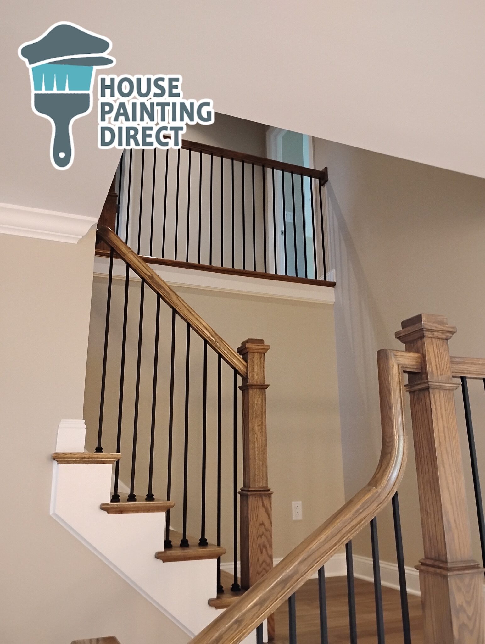
Older homes in Wilkes-Barre with traditional trim details often carry deeper colors beautifully because the architecture already provides visual texture and contrast.
Meanwhile:
- low-ceilinged rooms,
- limited-window layouts,
- or heavily compartmentalized spaces
may benefit more from lighter palettes that create breathing room visually.
The architecture usually gives clues if you pay attention to it.
Modern Design Is Moving Away From Extremes
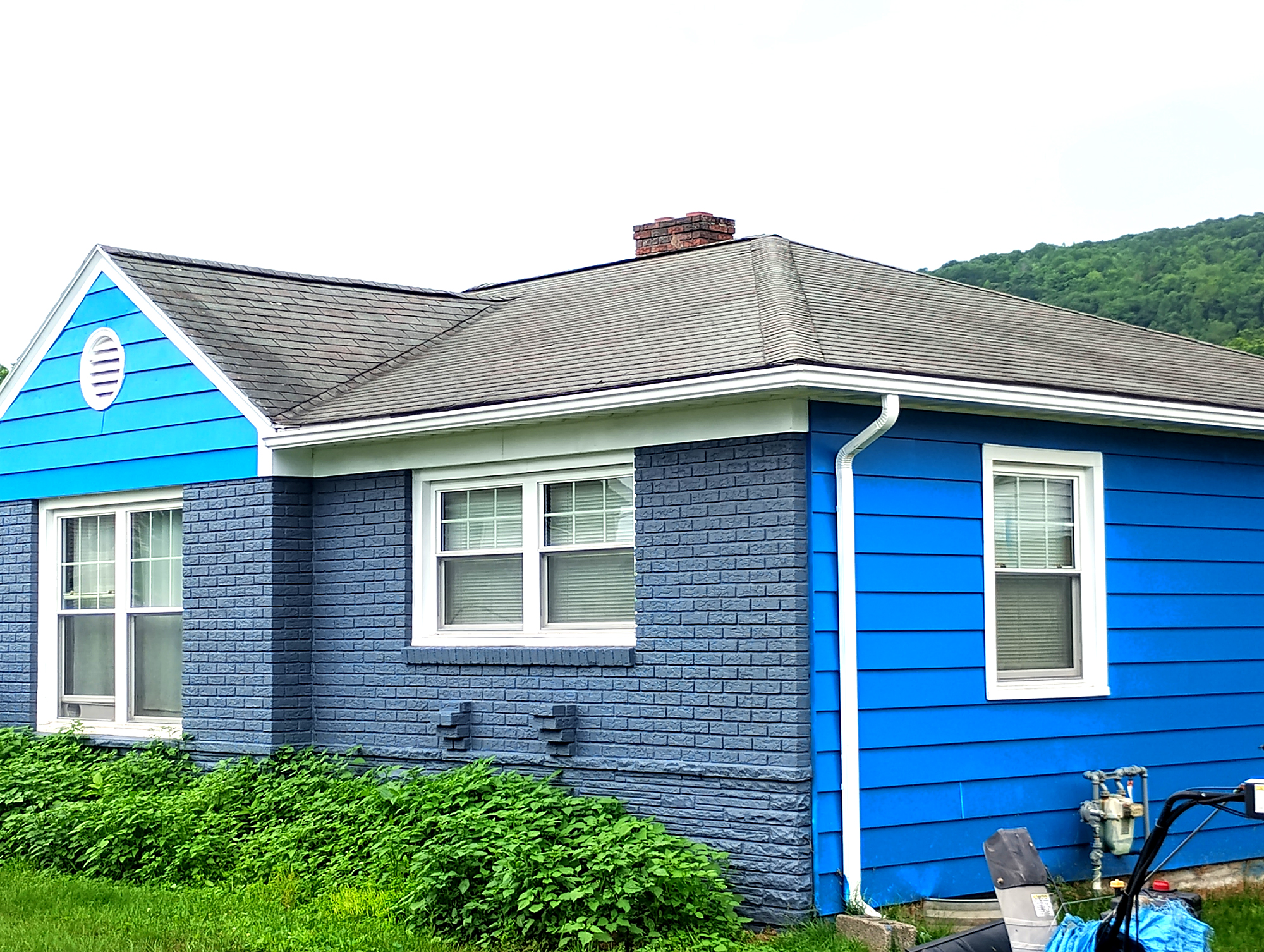
One of the biggest shifts in interior design right now is moderation.
The ultra-bright white-everything trend has softened.
But overly dark interiors are also fading in many spaces.
Instead, homeowners are gravitating toward:
- warm mid-tones,
- softened neutrals,
- muted earth colors,
- and balanced contrast.
In homes around Dallas or Shavertown, especially those with large windows overlooking wooded lots, many modern interiors now mix:
- lighter main living areas,
- darker accent rooms,
- and layered neutral transitions throughout the home.
That balance tends to feel timeless because it adapts to both architecture and lifestyle.
Why Flooring Changes Everything
Dark hardwood floors paired with dark walls can feel incredibly rich — or overwhelmingly heavy — depending on:
- ceiling height,
- window size,
- and sheen levels.
Likewise, pale flooring combined with ultra-bright walls can sometimes make a room feel sterile instead of airy.
A lot of homes throughout Luzerne County have warm oak flooring or natural wood trim that subtly pushes wall colors warmer whether homeowners realize it or not.
That interaction is where many color decisions either succeed beautifully or start fighting the room.
At House Painting Direct, we’ve helped homeowners across NEPA breathe new life into their houses. From Scranton to Wilkes-Barre and beyond, we know which painting projects make the biggest impact. Here’s why a professional paint job is worth the investment.
Light Paint Isn’t Automatically Safer
A lot of homeowners choose light colors because they fear regretting darker tones.
Ironically, overly safe paint choices often become the least satisfying long term.
Rooms painted in generic bright gray or flat builder white sometimes end up feeling unfinished emotionally — clean, but without warmth or identity.
Meanwhile, carefully selected deeper colors often create rooms people genuinely enjoy spending time in.
Not because they’re dramatic.
Because they feel intentional.
The Best Paint Choice Usually Feels Natural in the Space
When color works, people stop noticing the paint itself.
The room just feels balanced.
That balance might come from:
- soft creamy walls catching morning light,
- a moody office that feels calm during rainstorms,
- or a warm charcoal dining room glowing during winter evenings after snow settles outside.
In homes throughout the Poconos, Back Mountain, and the Wyoming Valley, the strongest interiors are rarely the brightest or darkest.
They’re the ones where the paint feels connected to:
- the light,
- the architecture,
- the surroundings,
- and the way the home is actually lived in.
That’s what makes a color choice last long after the trend cycle moves on.