
Be Beautiful

Perfect Color Match for a Seamless Look

Interior & Exterior Painting Tips, Tricks and Local NEPA Stories

The Same Paint Can Look Different From Morning to Evening

Choosing a paint color often begins with a small sample card, but the way that color looks in a store is rarely how it will appear once it’s on your walls. One of the biggest reasons is natural light. As the sun moves across the sky, the quality, intensity, and direction of daylight change, causing paint colors to shift throughout the day.

This is why a color you loved in the morning may seem warmer in the afternoon or noticeably darker after sunset. It’s not that the paint has changed—it’s the light interacting with the pigments, sheen, and surrounding surfaces.

For homeowners in Wilkes-Barre and throughout Northeastern Pennsylvania, understanding how natural light affects paint color is one of the smartest ways to make confident design decisions before opening a single can of paint.

Morning Light Creates a Cooler Appearance

East-facing rooms receive the most sunlight early in the day.

Morning light is generally:

  • Soft
  • Slightly cool
  • Crisp
  • Bright without being harsh

Because of this, paint colors often appear cleaner and more subdued during the morning hours.

Cool paint colors such as blues, greens, and soft grays may appear especially fresh, while warmer colors can seem more balanced and less intense.

As the day progresses and direct sunlight moves away, these same rooms typically become softer and more muted.

Test Paint Where It Will Actually Be Seen

Paint samples provide valuable information, but where they’re placed matters.

Instead of evaluating a color under only one lighting condition, observe it:

  • In the morning
  • Midday
  • Late afternoon
  • Evening with interior lighting
  • On sunny days
  • During cloudy weather

This approach offers a much more accurate understanding of how the finished room will look throughout daily life.

Paint Undertones Become More Noticeable

Every paint color has subtle undertones that may not be obvious until it is applied to a wall.

Common undertones include:

  • Blue
  • Green
  • Yellow
  • Red
  • Violet
  • Brown

Changing natural light can emphasize these undertones at different times of day.

For example, a gray paint that appears perfectly neutral under afternoon sunlight may reveal a blue or green cast on an overcast morning.

Understanding undertones helps explain why two similar paint samples can behave very differently in the same room.

Seasonal Changes Affect Interior Color Too

Natural light isn’t constant throughout the year.

In Northeastern Pennsylvania, seasonal differences influence how rooms feel.

During summer:

  • Longer daylight hours
  • Brighter sunlight
  • Stronger UV exposure

During winter:

  • Lower sun angles
  • Shorter days
  • More overcast skies
  • Snow reflecting additional light into some rooms

Homeowners in the Poconos, Mountain Top, and other wooded communities may also notice seasonal changes caused by tree cover. Rooms can feel significantly brighter in winter after leaves have fallen and more shaded during the summer months.

Color Choice Can Influence Heat Absorption

Many homeowners select paint colors based primarily on appearance, but color also affects how much heat the home’s exterior absorbs.

Generally speaking:

  • Dark colors absorb more solar heat.
  • Lighter colors reflect more sunlight.
  • Mid-tone colors often balance aesthetics and performance.

This doesn’t mean dark colors should be avoided. Many modern exterior paints are specifically designed to perform well even in deeper shades, provided they are appropriate for the surface and applied correctly.

Choosing a color should involve both design preferences and an understanding of how the home interacts with its surroundings.

Beautiful Color Depends on Beautiful Light

Selecting paint is about much more than finding a favorite shade. Every room has its own relationship with sunlight, and that relationship changes from sunrise to sunset and from season to season. By considering how natural light interacts with color, homeowners can create spaces that feel balanced, comfortable, and visually appealing throughout the day.

Whether you’re updating a historic home in Wilkes-Barre, refreshing a family room in Clarks Summit, or brightening a wooded retreat near Harveys Lake or the Poconos, taking the time to evaluate paint in real lighting conditions leads to more satisfying, longer-lasting design choices. When color and light work together, the result is a home that feels thoughtfully crafted from every angle and at every hour.

15 + 13 =

Adding on to your NEPA home doesn’t mean your walls have to look mismatched. We can carefully match existing colors, textures, and finishes so your new space feels completely natural and connected. If you’re ready for a fresh look, our painters can also help you choose modern colors that complement both your new and existing areas.

The Art and Science of Color Matching in NEPA Homes

Color matching is both a technical skill and a creative craft — especially in areas like Wilkes-Barre, Scranton, and Hazleton, where home styles range from historic Victorians to modern builds. Professional painters use advanced tools and keen visual judgment to perfectly blend new paint with existing finishes, trim, or siding. This ensures consistency across rooms and surfaces, maintaining the home’s overall harmony and curb appeal. True color matching brings together precision and artistry, creating a finish that feels original, not patched.
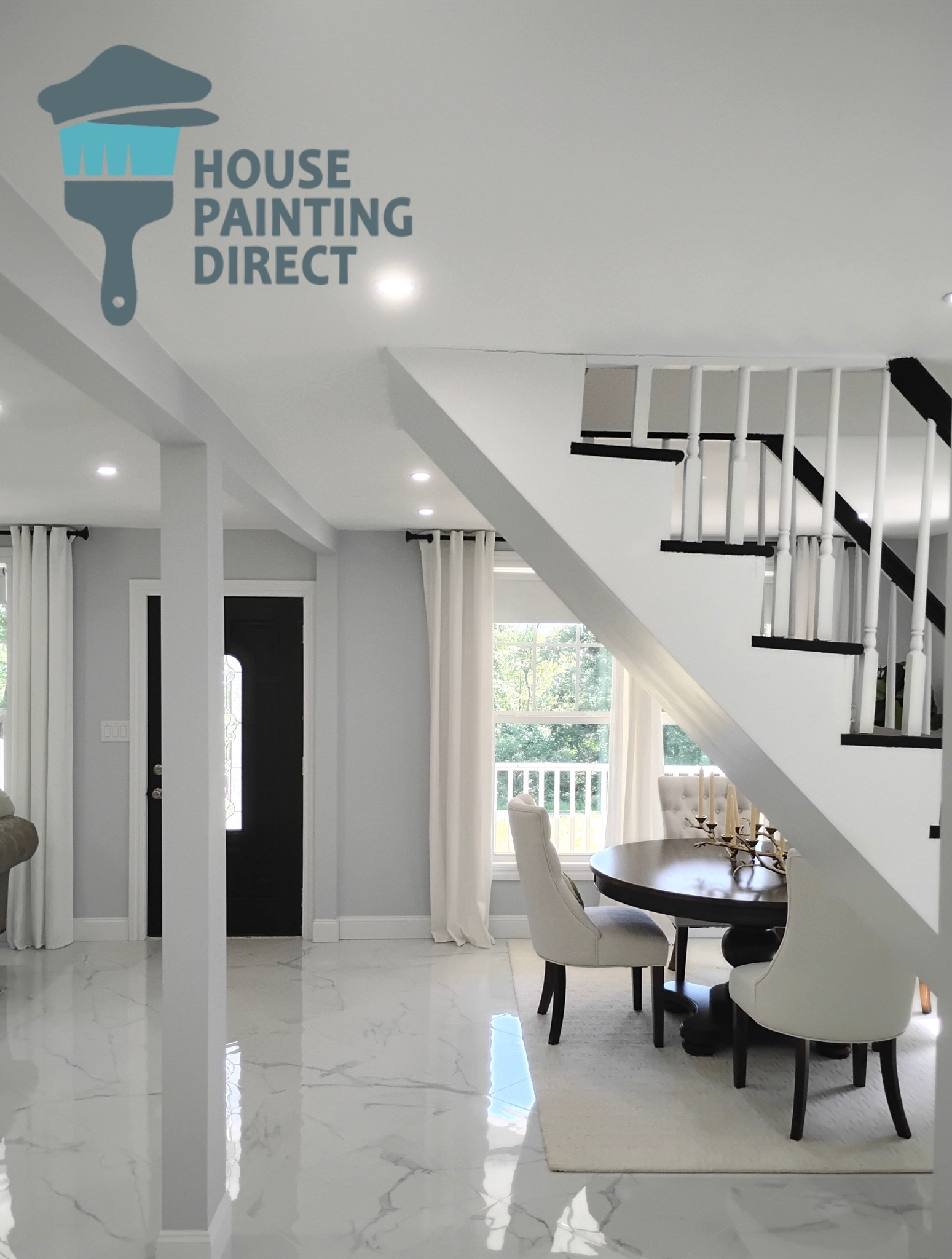
interior painting stairs railing ceiling trim windows white

13 + 10 =

Techniques and Tools Used for Professional Color Matching

Experienced painters in NEPA rely on both technology and training to get color right the first time. From digital spectrophotometers that scan and reproduce exact shades to hand-mixed tints matched by eye under natural light, precision tools ensure a seamless blend. Local professionals also account for lighting conditions — knowing that mountain light in Hazleton or shaded valleys near Dallas can shift color perception. The result is a perfect match that looks right in your home’s real environment, not just in a store sample.
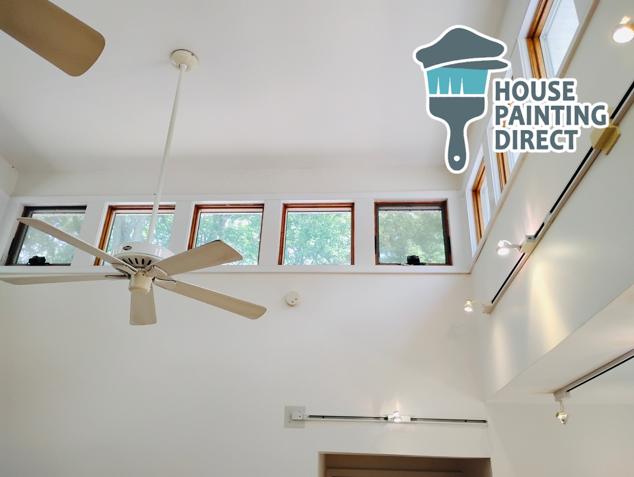
interior painting contractor dallas pa
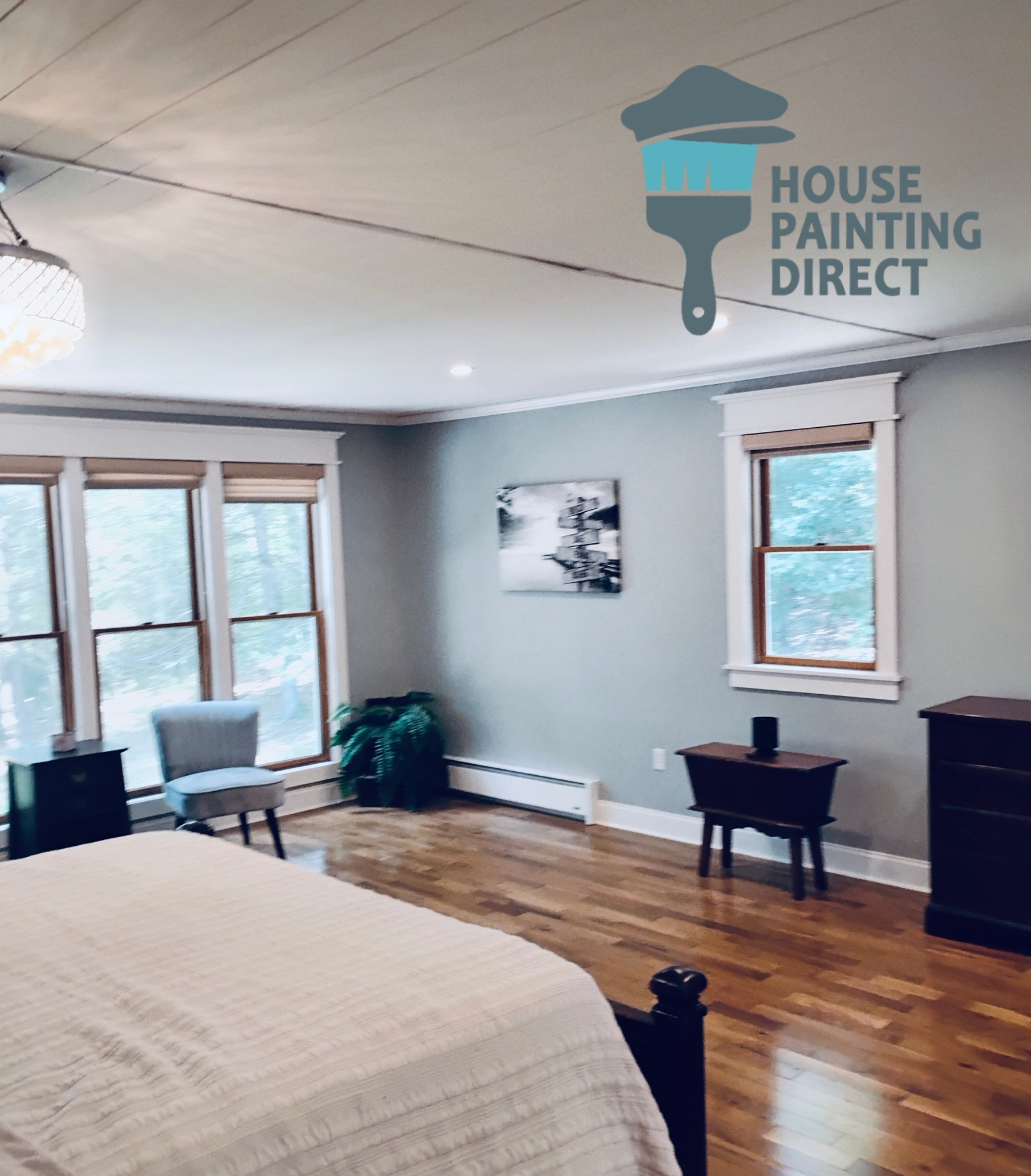
house painting bedroom bedroom walls and window trim

The Benefits of Accurate Color Matching for Your Home

Consistent color creates balance, beauty, and value across your entire property. A professional painter who can flawlessly match tones helps preserve the character of older homes while refreshing them with modern durability. In neighborhoods throughout Wilkes-Barre and Scranton, this attention to detail helps exterior touch-ups blend naturally and interior repaints look intentionally designed. With the right match, repairs disappear, transitions look seamless, and your home feels complete.

What Happens When Color Matching Is Done Wrong

Skipping proper color matching or hiring inexperienced painters can quickly turn into an eyesore. Mismatched shades show up clearly in sunlight, creating uneven walls, patchy exteriors, and jarring transitions between rooms. In NEPA’s mix of historic and newer homes, this can drastically reduce curb appeal and even lower property value. Professional house painters in Wilkes-Barre, Scranton, and Hazleton understand that small differences in tone matter — and take the time to make every shade align perfectly.

Ready to finish your renovation the right way?
Contact us today to schedule your home addition and renovation painting service — and watch your new space come to life with color and style.
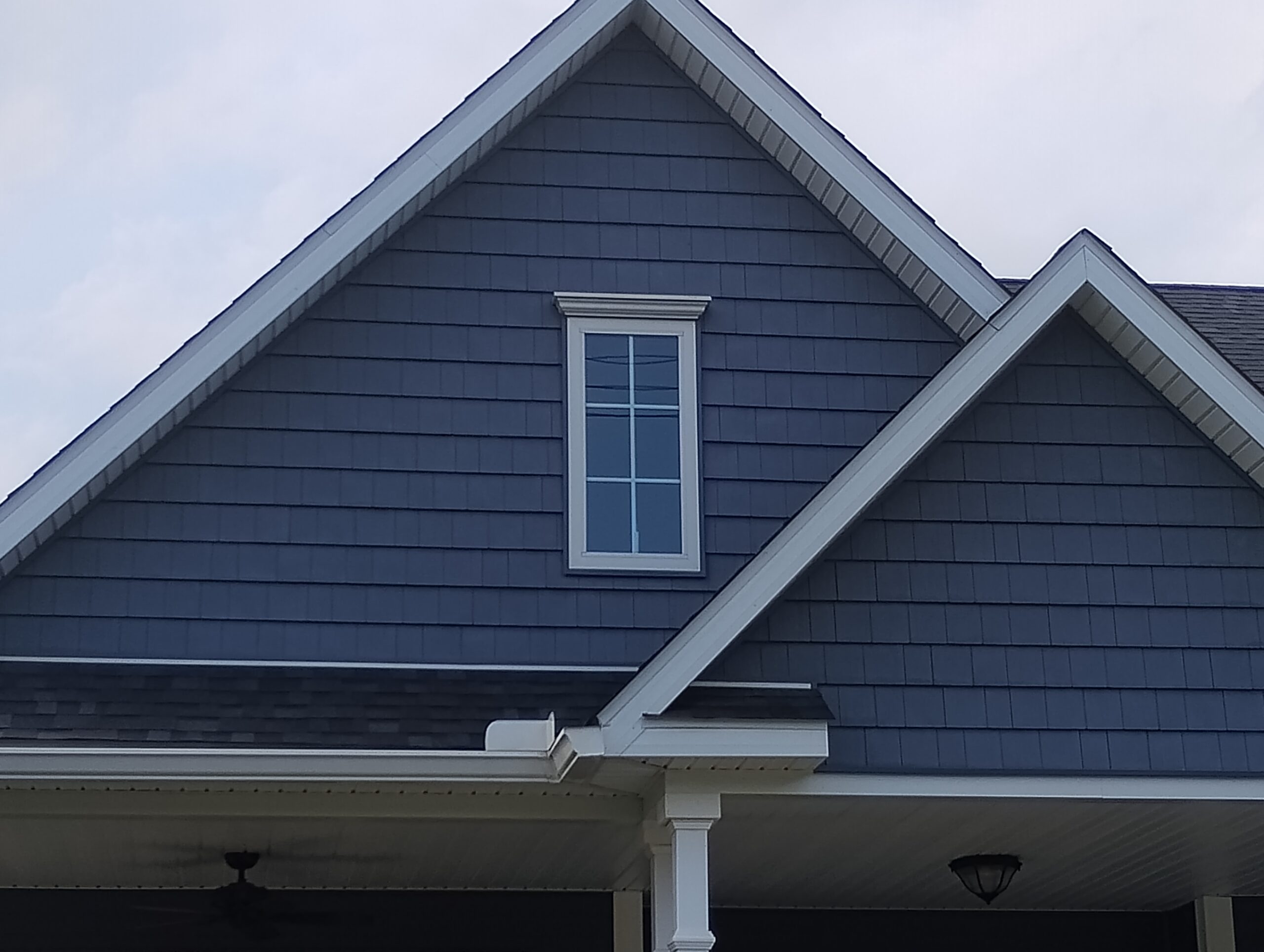
cedar shake exterior house painting blue and white trim wilkes-barre pa