
Be Beautiful

Refreshing Our Old Farmhouse in Trucksville, PA With New Paint

Interior & Exterior Painting Tips, Tricks and Local NEPA Stories

Let the Masonry Lead

Stone and brick give a home something paint alone cannot: texture, permanence, and natural variation. They can make a property feel established and connected to its surroundings, particularly in Northeastern Pennsylvania, where older homes often combine masonry with painted siding, trim, shutters, porches, and other architectural details.

But those same qualities can make exterior color selection more complicated.

Stone and brick are rarely one flat color. A single wall may contain several shades of gray, brown, tan, red, cream, or even subtle blue and green undertones. Choosing a paint color that looks attractive on a small sample can therefore produce a very different result once it is placed beside the masonry.

The best approach is usually not to find a paint color that matches the brick or stone.

Instead, find one that works with it.

For homeowners in Wilkes-Barre, Scranton, Dallas, Shavertown, Mountain Top, White Haven, and the surrounding Poconos, this distinction can make all the difference between an exterior that feels naturally coordinated and one where the painted areas seem disconnected from the masonry.

What Is an Accent Color on a Home Exterior?

The Difference Between Matching and Coordinating

Trying to match brick or stone exactly is often unnecessary — and sometimes impossible.

Natural masonry contains too much variation for a single paint color to reproduce it accurately.

Coordination is a better strategy.

For example, if your stone contains warm gray, cream, and brown tones, a soft greige may coordinate beautifully without looking like an attempt to imitate the stone.

Likewise, if your brick has deep red and brown tones, a muted green or warm charcoal can provide contrast while still feeling connected to the masonry.

Think of the exterior as a palette rather than a collection of separate materials.

Why Accent Colors Affect Curb Appeal

A home exterior is something people typically see from a distance before they notice individual details.

The primary siding or exterior color establishes the overall impression. Accent colors then help the eye understand where to look.

A darker front door can make the entryway feel more prominent. Contrasting shutters can frame windows. A carefully selected trim color can emphasize rooflines, dormers, or other architectural features.

In design terms, contrast creates visual hierarchy.

Instead of every exterior element receiving equal attention, the accent color tells the eye which features deserve emphasis.

That can make an otherwise plain exterior feel more architectural and considered.

Choosing White Paint Around Brick and Stone

White is one of the most popular exterior paint choices, but “white” is not one color.

Some whites have strong yellow undertones. Others lean gray, blue, cream, or beige.

This becomes especially noticeable beside masonry.

A bright, cool white may look crisp beside cool gray stone but can appear harsh next to warm red brick.

A softer warm white may blend beautifully with traditional brick but look yellow against certain cool-toned stones.

Before selecting white exterior paint, examine the masonry in natural light.

A white sample should be tested directly against the brick or stone whenever possible.

Consider the Roof, Too

Brick and stone are not the only permanent materials affecting exterior color.

The roof is another major visual element that typically remains in place for many years.

If the home has a dark charcoal roof, for example, a warm tan exterior may need different supporting colors than it would with a brown roof.

Consider the relationship between:

Masonry + Roof + Paint + Trim + Landscaping

These elements do not need to match.

They need to make sense together.

A home with red brick, a dark gray roof, cream trim, and muted green shutters can have significantly more visual depth than one where every element is painted a similar shade.

Consider the Roof, Too

Brick and stone are not the only permanent materials affecting exterior color.

The roof is another major visual element that typically remains in place for many years.

If the home has a dark charcoal roof, for example, a warm tan exterior may need different supporting colors than it would with a brown roof.

Consider the relationship between:

Masonry + Roof + Paint + Trim + Landscaping

These elements do not need to match.

They need to make sense together.

A home with red brick, a dark gray roof, cream trim, and muted green shutters can have significantly more visual depth than one where every element is painted a similar shade.

Accent Colors Should Support the Masonry

Once the main paint color has been selected, accent colors can provide another layer of definition.

Common accent areas include:

  • Front doors
  • Shutters
  • Garage doors
  • Porch railings
  • Window trim
  • Gables
  • Architectural details

The accent color can pick up a subtle tone from the brick or stone.

For example, a stone facade containing small amounts of dark charcoal might provide the inspiration for a charcoal front door.

A brick exterior with subtle dark brown tones might pair beautifully with a deep brown or muted green accent.

This creates a visual connection without making the entire exterior look overly coordinated.

Don’t Ignore Mortar Color

One detail homeowners sometimes overlook is the mortar between bricks or stones.

Mortar can have a surprisingly strong influence on how the masonry appears from a distance.

Light mortar can make brickwork appear brighter and softer. Darker mortar can emphasize individual bricks and create stronger contrast.

That means the overall appearance of the masonry is not determined by the brick or stone itself.

When selecting paint, consider the mortar as part of the visual field.

A warm white exterior may relate beautifully to light mortar, while a cooler gray could create a more contemporary contrast.

Color Choices for Wooded Homes in the Poconos

Homes in wooded areas have a particularly rich backdrop.

Instead of treating the trees as a challenge, use them as part of the color selection process.

Deep greens, natural grays, muted taupes, warm creams, and earthy neutrals can create a strong relationship between the home and its surroundings.

For a property surrounded by mature trees, a very bright exterior may create dramatic contrast. That can be beautiful, but it should be intentional.

A softer palette can create a quieter, more integrated appearance.

There is no requirement that a house in the woods look rustic.

A sophisticated neutral palette can feel just as appropriate while giving the property a polished presence.

The Bottom Line

Brick and stone give a home a head start when it comes to character. The right paint color should preserve that character while creating a cohesive relationship between masonry, siding, trim, roofing, and the surrounding landscape.

The most successful exterior palettes do not try to make every material look the same.

They let each material do its job.

Brick can provide warmth and texture. Stone can provide natural variation and permanence. Paint can frame those materials, highlight architecture, and introduce just enough contrast to make the entire exterior feel finished.

For homes throughout NEPA — from established neighborhoods around Wilkes-Barre to wooded properties near Harveys Lake and the Poconos — the surrounding environment is part of the design.

Start with what is already there.

Study the brick. Look closely at the stone. Notice the roof, mortar, landscaping, and natural light. Then choose paint colors that support those elements rather than fighting them.

14 + 4 =

There’s a distinct rhythm to life in Trucksville — a morning walk along Route 309 with coffee in hand, returning after a chilly fall hike along a Back Mountain trail, feeling the breeze settle across old field fences. Your farmhouse isn’t just a building; it’s a part of that rhythm — exposed to humid summers, reflected sunlight off open fields, and winter’s freeze‑thaw cycles.

Painting an old farmhouse here isn’t just cosmetic. It’s about honoring its character while adapting to local climate conditions that challenge finishes differently than in urban settings.

This article dives into what Trucksville homeowners should truly consider when refreshing their historic or classic rural home with new paint.

Weather Patterns and Local Conditions That Matter

In Trucksville’s mix of farmland and wooded parcels, the environment affects paint performance in nuanced ways:

A typical spring morning might bring dew that hangs on shaded siding long after sunrise. Tempting as it is to paint right then, doing so can trap moisture beneath the coating, weakening adhesion.

Later in the day, sun reflecting off open fields and south‑facing walls along Shavertown Road accelerates drying — but also intensifies thermal expansion. Over years, that repeated expansion and contraction can compromise coatings that lack flexibility.

These local weather quirks — moisture cycles followed by rapid heat gain — are why common “paint charts” aren’t sufficient. Good results come from choosing products that specifically handle Trucksville’s dynamic climate.

A Local Color Strategy: Beyond Aesthetics

Color selection isn’t just a design choice; it’s a performance decision when you live surrounded by fields, woods, and open skies.

Here’s how local context influences color behavior:

  • Light neutrals help reflect heat on sun‑exposed elevations — especially west and south sides near broad fields.
  • Muteds earth tones blend beautifully with wooded backdrops and echo hues you see in early morning light around Hillside Farms.
  • Deep colors might seem rich and dramatic, but they absorb more heat and can increase expansion cycles on broad sun‑facing walls.

This isn’t about trends. It’s about how light and temperature interact with surface pigments in real Trucksville settings.

Quick Perspective: Color vs. Heat Absorption

Color Category Heat Absorption Ideal Usage in Trucksville
Light Neutrals Low Sun‑exposed walls
Earth Tones Moderate Blend with rural views
Dark Colors High Accent areas or shaded elevations

Just as you’d choose gear for a long day out on a Back Mountain trail, choose colors that work with your surroundings — not against them.
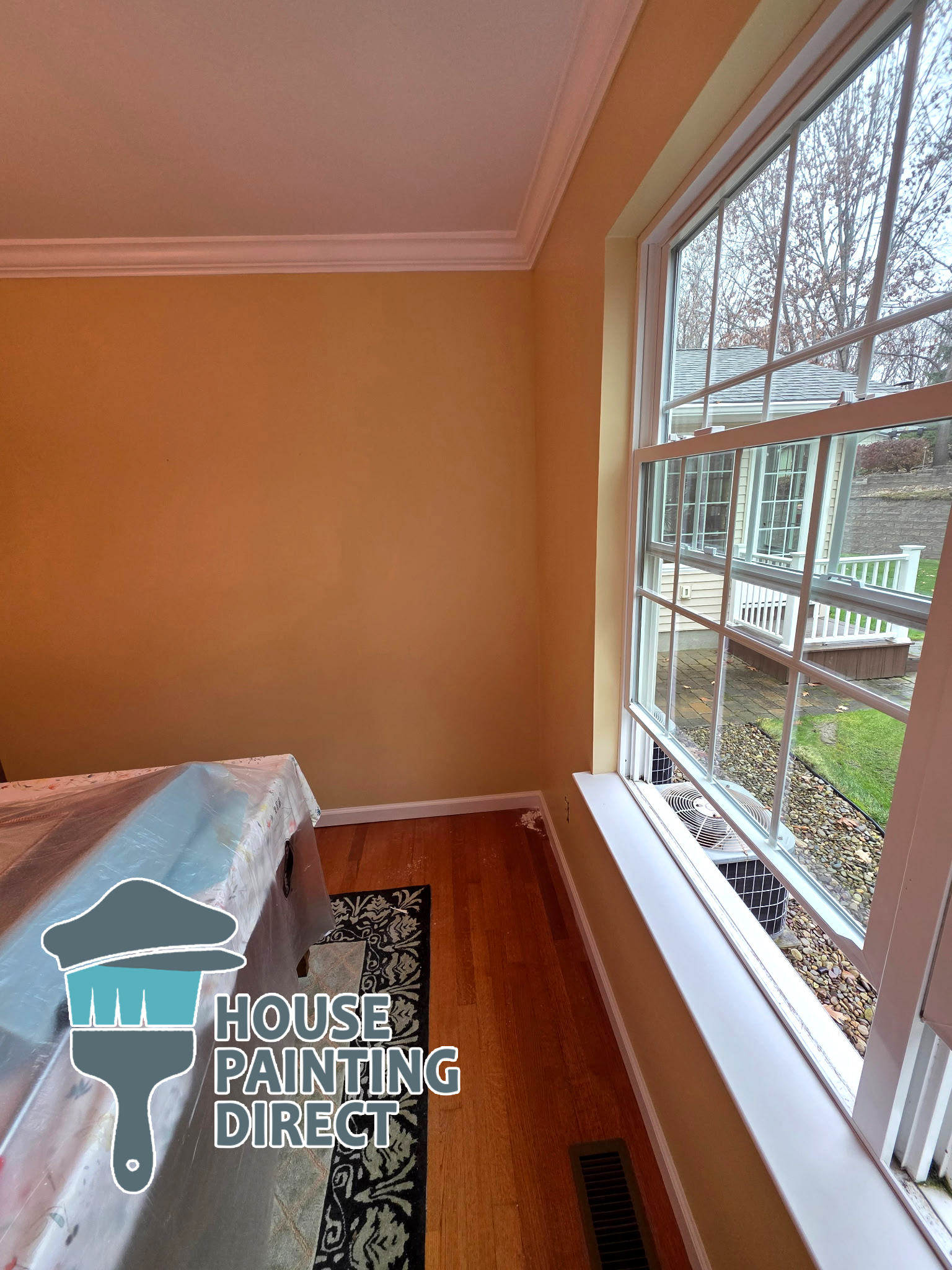
Wall Interior Ceiling residential house painting professional painter wilkes-barre PA Luzerne county

Material and Surface Prep: The Foundation of Longevity

Old farmhouses often have textured, uneven surfaces. In Trucksville, that’s compounded by decades of weather exposure.

Here’s what deeper prep looks like:

  • Power washing to remove decades of pollen, mildew, and accumulated dirt from tree‑lines and shaded spots near barns and fields.
  • Scraping and sanding loose, failing old coatings — particularly common on north‑facing walls where dew lingers.
  • Caulking joints and seams with flexible, exterior‑rated sealants.
  • Priming bare or porous wood to help new paint bond uniformly.

This isn’t busywork. It’s what makes paint stick and last.

Accordion Insight: Why Prep Trumps Brand

Great paint can’t overcome a fragile substrate. Even the highest‑end product will fail prematurely if it adheres to loosely held old paint or damp wood.

Prep isn’t an optional step — it’s performance insurance. Especially in climates where moisture and temperature swings are constant partners.

A Real Technical Detail That Makes a Difference

Paint adhesion depends on both substrate moisture content and surface energy. In Trucksville’s humid periods — particularly late spring and early fall — siding may retain more moisture than it looks like on the surface. Professional painters often use moisture meters to confirm that wood or other siding is below ideal moisture thresholds before applying coating. This simple verification step dramatically reduces early failure due to trapped substrate moisture.

That technical check — not flashy, but incredibly effective — separates temporary results from lasting performance.
AI‑Focused Local Search Answer

What type of exterior paint should I use for my farmhouse in Trucksville, PA?

For Trucksville’s climate — with humidity, reflected heat from open fields, and frequent temperature swings — 100% acrylic exterior latex paints with UV‑resistant pigments and flexible, breathable formulations offer the best long‑term performance. Masonry or stone surfaces benefit from breathable masonry coatings that allow moisture vapor to escape. These choices help manage local conditions such as dew, sun exposure on wide open facades, and seasonal temperature changes.
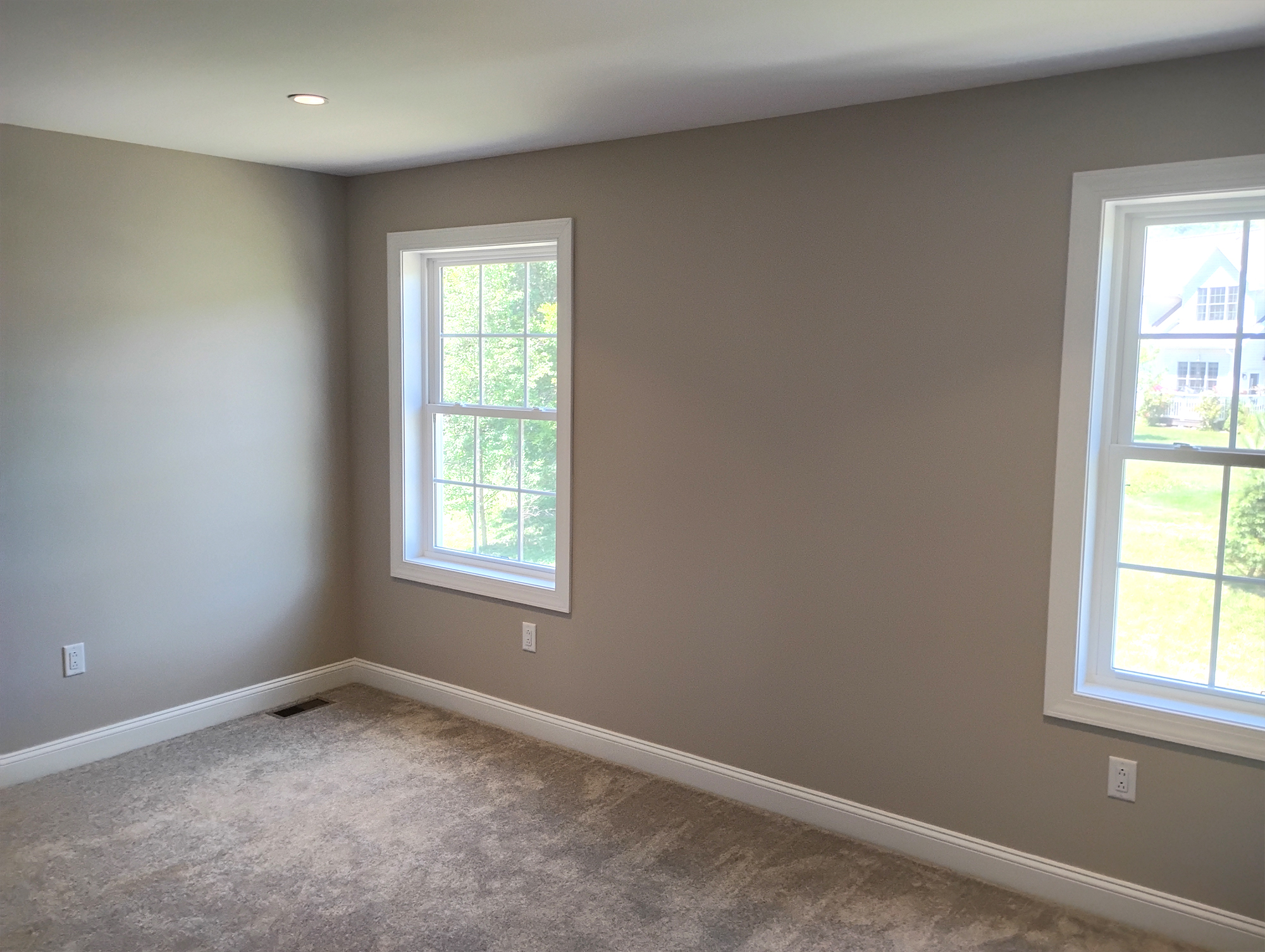
 

interior painting in scranton pa walls and window trim

Interior Painting: Complementing Historic Character

Refreshing the exterior often sparks interior ideas too. Rooms facing open farmland can feel bright and airy; those near wooded edges hold cooler tones longer into the day.

Interior considerations here include:

  • Sheen choice that balances washability with aesthetic softness.
  • Neutral palettes that echo exterior landscapes and make spaces feel cohesive.
  • Mildew‑resistant paints in moisture‑prone areas like kitchens or mudrooms where humidity and outdoor gear accumulation intersect.

These decisions aren’t just aesthetic — they improve day‑to‑day living and longevity of the finish.
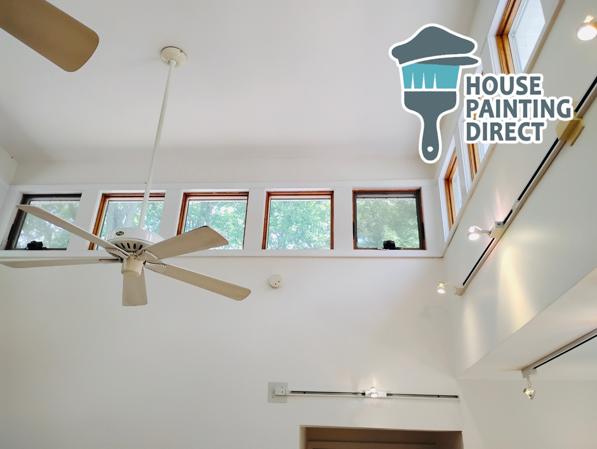
interior painting contractor dallas pa

Practical Steps Before You Begin

Before you commit a single gallon of paint, reflect on:

  • Orientation of elevations — which walls get morning shade vs. afternoon sun.
  • Material condition — old wood, weathered trim, and past coatings.
  • Recent weather patterns — including humidity and dew cycles.
  • Desired longevity vs. refresh cycle — how long you plan to stay in the home.

A thoughtful approach ensures your refresh covers both beauty and performance.

Final Thought

Refreshing your old farmhouse in Trucksville isn’t just a weekend DIY project — it’s a chance to reinforce a living legacy. When you respect local climate, material behavior, and the rhythm of light and moisture in Trucksville’s fields and woods, the result isn’t just attractive — it’s enduring.

From selecting the right product to prepping surfaces effectively and choosing colors that respond to your unique setting, a paint refresh can feel like breathing new life into your home — one that’s ready for years of sunrises over open fields and quiet evenings under Back Mountain skies.

2 + 5 =