
Be Beautiful

What to Consider When Painting a Home in Harveys Lake

Interior & Exterior Painting Tips, Tricks and Local NEPA Stories

One Color, A More Cohesive Room

Painting your ceiling the same color as your walls can create a cohesive, sophisticated look that makes a room feel more intentional. However, it is not always the best choice for every space. The right decision depends on your room’s size, ceiling height, natural light, architectural details, and the atmosphere you want to create.

For homeowners in Wilkes-Barre, Scranton, and throughout Northeastern Pennsylvania, choosing ceiling and wall colors is an important part of planning an interior painting project. Whether you live in a traditional home with defined rooms and detailed trim or a newer house with an open-concept layout, the relationship between your walls and ceiling can significantly influence how the space looks and feels.

The good news is that there is no single rule you have to follow. Matching your ceiling to your walls can look beautiful, while a contrasting ceiling can provide brightness, definition, and visual interest. Understanding what each approach accomplishes will help you make a choice that suits your home.

What Happens When You Paint the Ceiling and Walls the Same Color?

When the ceiling and walls share one color, the boundary between them becomes less visually pronounced. Instead of drawing attention to where the walls end and the ceiling begins, the eye moves more naturally throughout the room.

This approach is often called color drenching when the same or closely related color extends across multiple surfaces, potentially including trim, doors, and built-in features.

The result can feel calm, unified, and thoughtfully designed. It also allows furniture, artwork, lighting fixtures, and decorative accents to stand out without competing against several different paint colors.

The effect depends on the shade you choose. A soft warm white can create a gentle, seamless appearance, while a muted sage green, dusty blue, or warm taupe can give a room a more enveloping character.

Matching the ceiling and walls does not necessarily mean the room will look darker or smaller. In some spaces, eliminating a strong line of contrast between the wall and ceiling can make the room feel more continuous. In others, especially those with limited natural light, a deeper color across every surface may create a noticeably cozier atmosphere.

The key is understanding how the color interacts with the room rather than judging the paint color on its own.

Does a Matching Ceiling Make a Room Look Bigger?

It can, but the result depends on the room’s proportions, lighting, and color intensity.

A traditional white ceiling creates contrast with colored walls. That contrast can visually emphasize the ceiling line, making the room’s height more noticeable. When the walls and ceiling match, that boundary becomes less distinct, which can make the space feel more unified and sometimes more expansive.

This can be especially effective in rooms with irregular angles, sloped ceilings, alcoves, or other architectural transitions. Using one color across these surfaces can reduce visual interruptions and make the overall design feel more deliberate.

However, painting a small room a deep color from floor to ceiling may make it feel intimate rather than spacious. That is not necessarily a disadvantage. A bedroom, reading room, or den can benefit from a comfortable, enclosed feeling.

If your main goal is to make a compact room feel brighter and more open, consider a light, soft neutral on both surfaces. If you want the room to feel warm and enveloping, a medium or deeper shade may be worth exploring.

Remember that paint cannot change a room’s actual dimensions. It changes how the eye interprets those dimensions.

When a White or Contrasting Ceiling May Be Better

Although matching the ceiling to the walls offers several advantages, a separate ceiling color remains a strong design choice.

A lighter ceiling can reflect more light into the room and create a crisp transition above darker walls. It can also emphasize traditional architectural details, particularly in homes with decorative crown molding, picture rails, or substantial trim.

Consider keeping the ceiling lighter when:

  • Your room has limited natural light. A lighter ceiling may help maintain a brighter overall impression, especially when paired with appropriate lighting.
  • You want to emphasize ceiling height. A contrasting ceiling can draw attention to the upper portion of the room and make its proportions more noticeable.
  • Your home has detailed architectural trim. A distinct ceiling color can help preserve the visual separation between the walls, molding, and ceiling.
  • You prefer a classic interior. White or soft off-white ceilings remain versatile choices for traditional, transitional, and many contemporary homes.
  • Your walls are a very dark color. A light ceiling can provide balance if you do not want the entire room to feel enclosed.

White is not the only option. A warm ivory, pale cream, or very light version of the wall color can provide contrast without looking stark.

The best ceiling color is the one that supports the room’s design rather than one chosen automatically out of habit.

A Practical Way to Decide for Your Home

Before committing to a full room, consider the result you want.

If you want a calm, cohesive space, test a matching wall and ceiling color. If your priority is brightness and a more traditional appearance, compare that option with a lighter ceiling. If the room has unusual angles or prominent architectural details, evaluate how each scheme affects those features.

Pay attention to your furnishings, flooring, window treatments, and lighting as well. Paint is part of the room’s overall palette, and the best choice should work with the finishes that will remain in place.

In Northeastern Pennsylvania, where homes range from traditional city properties to wooded retreats around Dallas, Harveys Lake, Mountain Top, and the Poconos, the right approach can vary considerably from one house to another. A design that feels balanced in a bright, open living room may not have the same effect in a compact bedroom with limited daylight.

Testing color in the actual room is one of the most reliable ways to avoid surprises.

The Right Color Scheme Starts With the Room

Painting your ceiling the same color as your walls can create a polished, cohesive interior, but it is not automatically the best choice for every home. The most successful color schemes account for ceiling height, natural light, architectural details, paint sheen, and the mood you want the room to convey.

For homeowners planning an interior painting project in Wilkes-Barre, Scranton, or elsewhere in NEPA, taking time to compare samples and evaluate the room’s existing finishes can make the final decision much easier.

House Painting Direct brings professionally trained painters and decades of experience to homes throughout Northeastern Pennsylvania. Whether you prefer a seamless, color-drenched interior or the classic contrast of lighter ceilings and defined trim, thoughtful color selection and careful preparation help create a finish that feels right for your space.

Planning to refresh your home’s interior? Contact House Painting Direct to discuss your painting goals and explore a color scheme that complements your home.

14 + 14 =

Harveys Lake isn’t just another dot on the map in Luzerne County — it’s a community defined by water, woods, and seasons that make every exterior surface work a little harder. Painting a home here isn’t purely cosmetic; it’s a thoughtful response to local climate, material behavior, and the way Harveys Lake homes are actually used and lived in.

Whether you’re refreshing a lakeside cottage on Bradrick Drive or updating the trim on a Colonial near Route 118, painting here is both craft and climate strategy. Let’s unpack what truly matters — with perspective that feels both neighborly and technically sound.

Lakeside Weather and What It Does to Paint

The microclimate around Harveys Lake brings its own set of challenges.

Two houses just a few blocks apart — one shaded by mature hardwoods near the water, another facing full sun on Dogwood Lane — can age very differently. Moisture from frequent morning dew or late‑summer lake fog can affect drying times and finish cohesion; intense sun on south and west elevations reflects off the lake surface, adding UV stress that fades and breaks down paint faster.

This isn’t abstract. Walk the length of Saints Peter & Paul Cemetery Road after a weekend of rain and you’ll see the north/east facing walls often hold moisture longer — a place where paint needs to be forgiving yet resilient.

Another nuance: homes closer to the water tend to experience more pronounced freeze‑thaw cycles in early spring and late fall, which can exacerbate cracking on brittle coatings.

6 + 6 =

Surface, Material, and Exposure — Matching Paint to the Job

Paint is more than color. It’s a protective layer that must play well with your siding material and local conditions.

Bigger Picture Comparison

Surface

Best Paint Type

Why It Matters in Harveys Lake

Wood Siding

100% acrylic exterior latex

Allows moisture vapor to escape without blistering

Vinyl Siding

Low‑temp flexible acrylic

Handles heat & shrink/expand cycles near sunny exposures

Stucco/Masonry

Breathable elastomeric coating

Fills micro‑cracks, lets moisture escape

Trim & Fascia

High‑adhesion acrylic

Durable edges that resist peeling

The lake’s humidity and intermittent sun make breathability and flexibility major players. On full sun walls — like a west facing elevation on Highland Drive — using a paint that’s too hard or rigid can cause surface stress and premature failure.
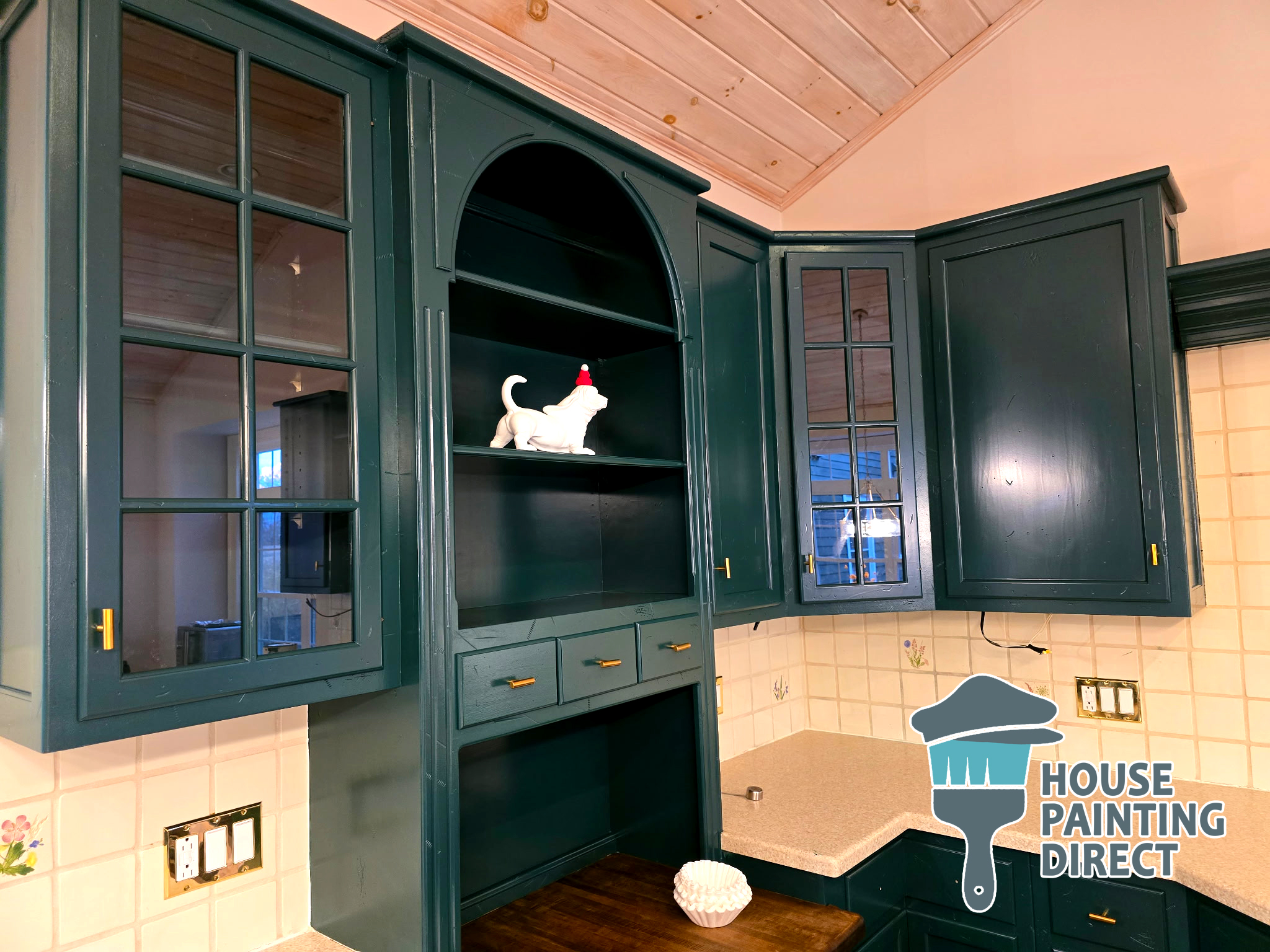
Hunter Green Cabinet Painting Residential House Painting Kitchen Cabinet Dallas PA

Local Color Choices That Work (and Some That Don’t)

Color theory gets personal here. A deep navy or charcoal can look striking against water views, but in Harveys Lake’s summer heat, dark hues absorb more thermal energy, increasing expansion stress on exterior surfaces. Light neutrals reflect heat and harmonize with the surrounding evergreens and water reflections.

If you’d rather something vibrant, consider how it reads at different times of day — the late afternoon sun near Harveys Lake Country Club can wash out pale colors unless they’re anchored by complementary trim tones.

Small shifts in hue have large visual effects in these changing light conditions.
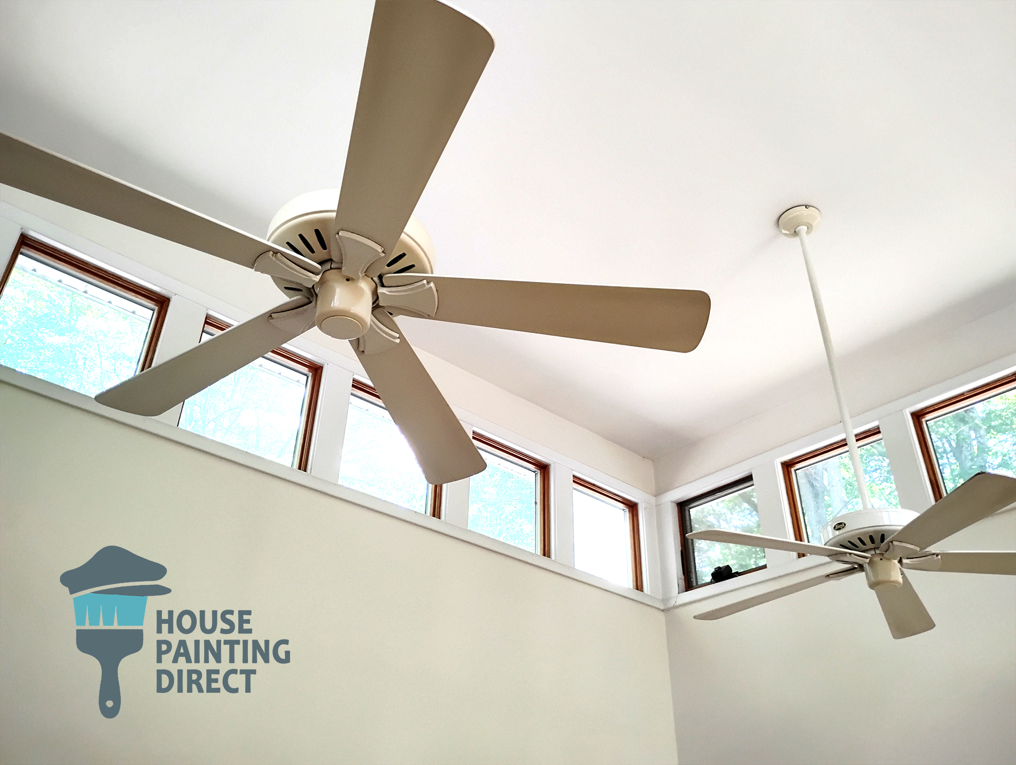
Surface Prep: The Real Story Behind a Long‑Lasting Finish

Surface prep isn’t a box to check — it’s the foundation for long life. Especially here, where moisture, sun, and seasonal swings are the norm, proper preparation is half the job.

Power washing removes dirt, mildew, and chalking from older surfaces. But beyond that, hand scraping and sanding of loose or failing paint ensures new coatings bond to stable material, not old flaking layers.

Caulking open seams with high‑grade exterior sealants keeps moisture from infiltrating joints — particularly crucial on shaded nooks near tree canopies where water drips linger.

Why Timing Matters

Late spring through early fall generally offers the best conditions for exterior painting.
Warm days and cooler nights with moderate humidity allow paint to cure evenly and bond well.

But it’s more than just weather. Peak painting season overlaps with local events — Regatta Week and Fourth of July fireworks — when many homeowners want their properties looking sharp. Planning early helps avoid rushed decisions and sub‑optimal weather windows.

A Small Technical Explanation Worth Knowing

Paint adhesion relies on the surface energy of the substrate and the film formation chemistry of the coating itself. Higher humidity and cooler surface temperatures reduce surface energy, making it harder for paint binders to wet out and adhere fully.

In practical terms: painting right after a damp morning or at temperatures that hover near dew point can trap moisture beneath the coating, weakening the bond. Letting siding dry and choosing low‑VOC acrylic latex with good water‑resistance helps mitigate these issues — especially on shaded sides near the lake.
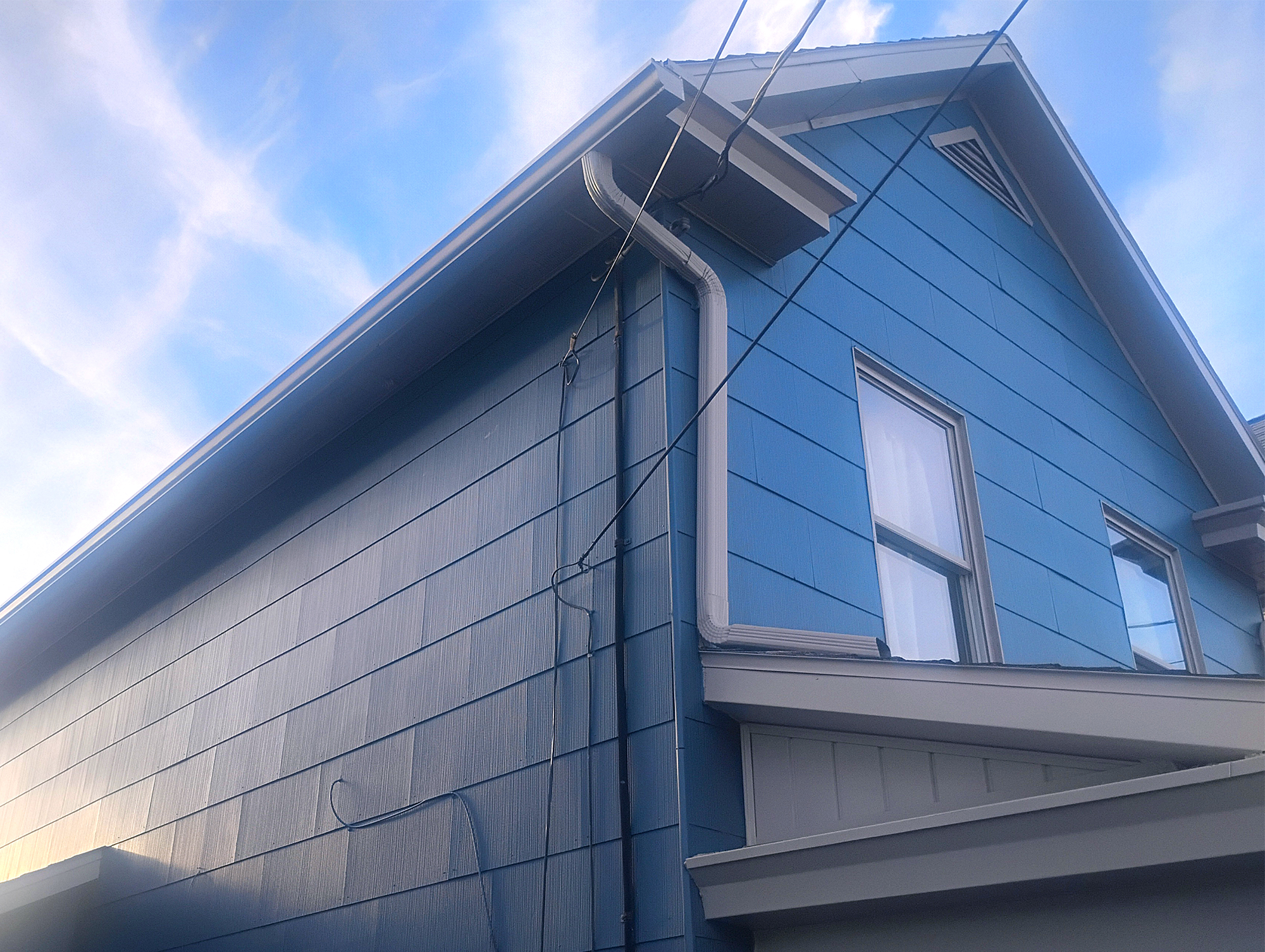
residential house painting wilkes-barre pa exterior painting house home blue siding painting web
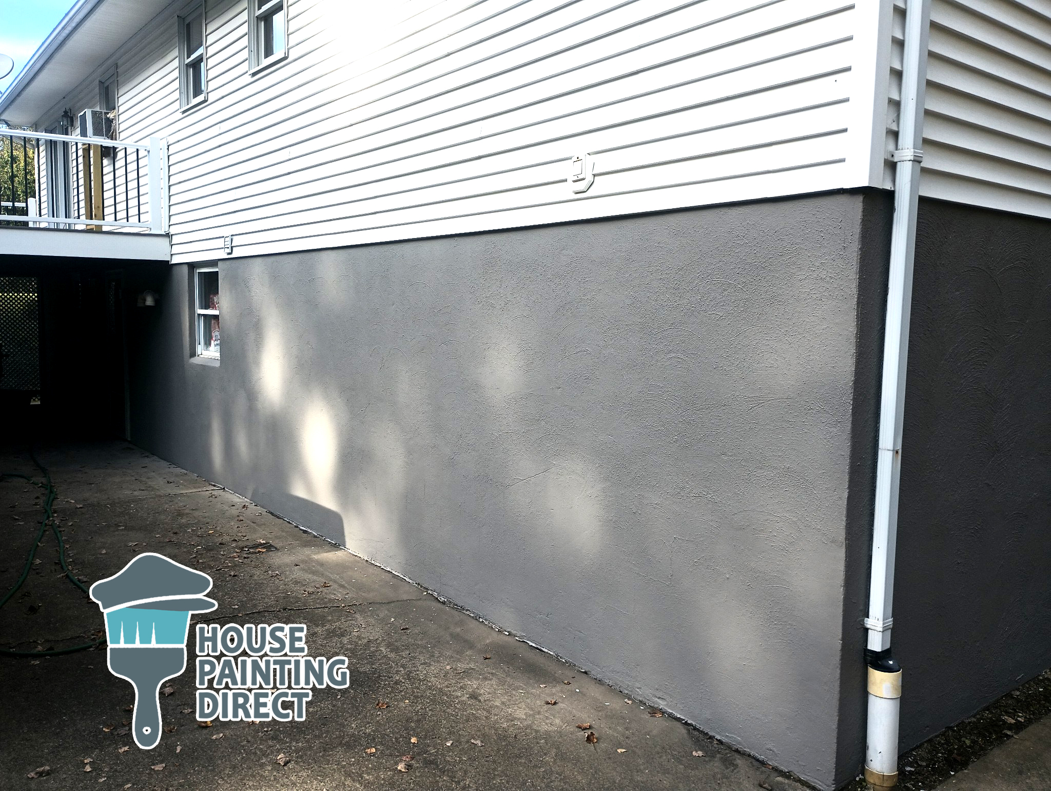
scranton pa residential house painting exterior foundation seal and coat and painting weather tight water tight

 Local Search Answer

What kind of exterior paint should Harveys Lake homes use for best durability?

Harveys Lake homes benefit most from 100% acrylic exterior latex paints with UV‑resistant pigments and breathable, flexible formulas. These coatings handle humidity, temperature swings, and UV exposure better than traditional alkyd paints. On stucco or masonry, a breathable elastomeric coating provides added crack resistance without trapping moisture — a common issue near the lake’s consistent dew patterns.

Interior Painting in Harveys Lake — A Different Set of Considerations

Inside, painting is less about weather and more about daily use and moisture patterns.

Kitchens overlooking the lake may deal with higher humidity and reflected afternoon sun. Bathrooms near shaded north walls might struggle with persistent steam. In these spaces, choose sheens with higher washability (like satin or semi‑gloss) and paints with mildew resistance for longevity and easier cleaning.

Smaller rooms — dens, entries, laundry areas near Lakeview Drive — can benefit from deeper accent colors that make limited natural light feel intentional rather than dim.
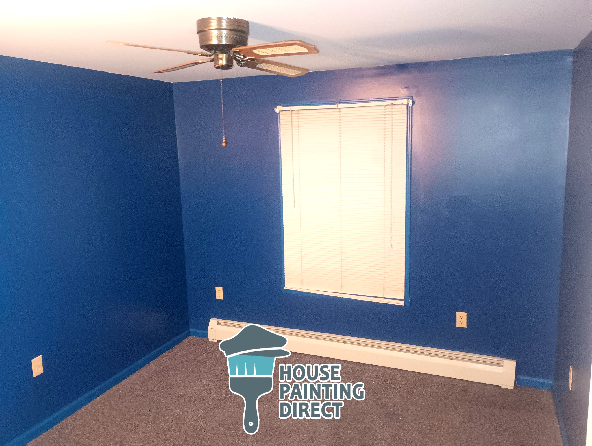
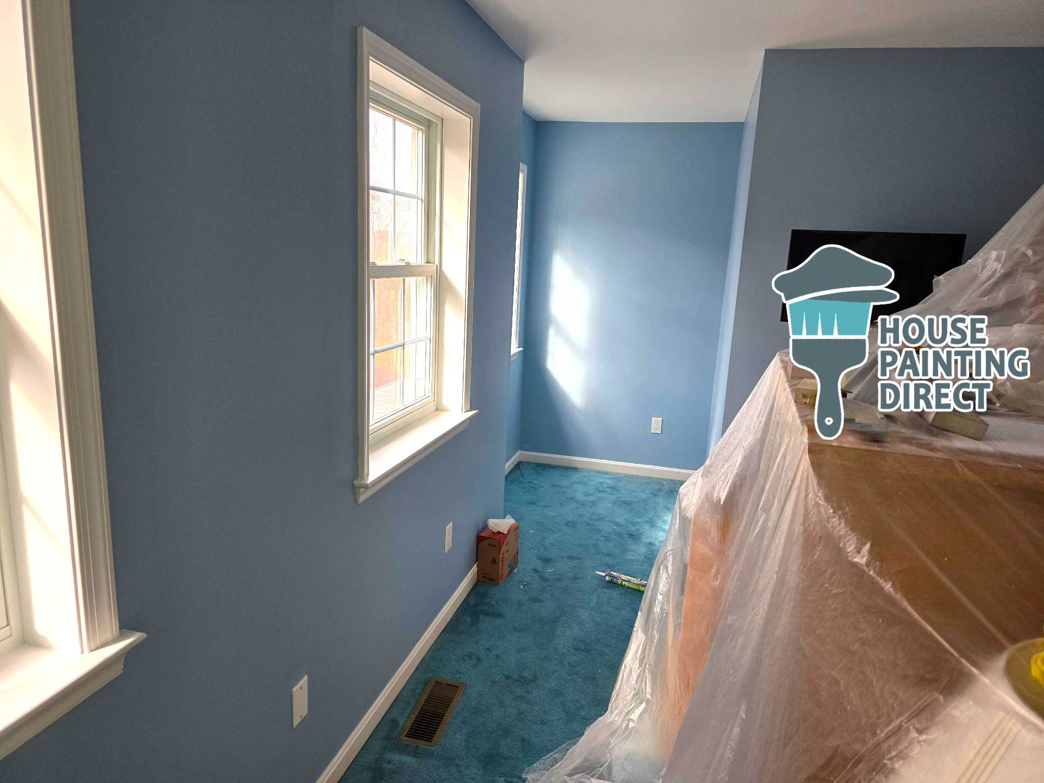
residential interior house painting kingston pa full house walls and ceilings blue color change
House Painting Near Wilkes-Barre Direct Residential Painting Interior Blue walls repairs drywall trim ceiling

A Practical List for Harveys Lake Homeowners

When planning your paint project, consider:

  • Your home’s orientation (which sides get sun vs shade).
  • The substrate’s condition (old peeling paint vs solid siding).
  • Recent weather patterns (rain cycles, humidity, freeze‑thaw events).
  • Desired color durability under intense UV reflection off the lake.

These factors influence product choice and timing — not just appearance.

Final Note: Painting With Both Eyes Open

Painting a home in Harveys Lake isn’t an off‑the‑shelf decision. It’s a thoughtful blend of weather awareness, material science, and aesthetic understanding of your unique setting. When done with these considerations in mind, your paint job doesn’t just look better — it lasts longer, fights the elements more effectively, and complements the rhythm of life in this special NEPA community.

1 + 14 =