
Be Beautiful

What to Expect From a Professional House Painting Service

Interior & Exterior Painting Tips, Tricks and Local NEPA Stories

Let the Masonry Lead

Stone and brick give a home something paint alone cannot: texture, permanence, and natural variation. They can make a property feel established and connected to its surroundings, particularly in Northeastern Pennsylvania, where older homes often combine masonry with painted siding, trim, shutters, porches, and other architectural details.

But those same qualities can make exterior color selection more complicated.

Stone and brick are rarely one flat color. A single wall may contain several shades of gray, brown, tan, red, cream, or even subtle blue and green undertones. Choosing a paint color that looks attractive on a small sample can therefore produce a very different result once it is placed beside the masonry.

The best approach is usually not to find a paint color that matches the brick or stone.

Instead, find one that works with it.

For homeowners in Wilkes-Barre, Scranton, Dallas, Shavertown, Mountain Top, White Haven, and the surrounding Poconos, this distinction can make all the difference between an exterior that feels naturally coordinated and one where the painted areas seem disconnected from the masonry.

What Is an Accent Color on a Home Exterior?

The Difference Between Matching and Coordinating

Trying to match brick or stone exactly is often unnecessary — and sometimes impossible.

Natural masonry contains too much variation for a single paint color to reproduce it accurately.

Coordination is a better strategy.

For example, if your stone contains warm gray, cream, and brown tones, a soft greige may coordinate beautifully without looking like an attempt to imitate the stone.

Likewise, if your brick has deep red and brown tones, a muted green or warm charcoal can provide contrast while still feeling connected to the masonry.

Think of the exterior as a palette rather than a collection of separate materials.

Why Accent Colors Affect Curb Appeal

A home exterior is something people typically see from a distance before they notice individual details.

The primary siding or exterior color establishes the overall impression. Accent colors then help the eye understand where to look.

A darker front door can make the entryway feel more prominent. Contrasting shutters can frame windows. A carefully selected trim color can emphasize rooflines, dormers, or other architectural features.

In design terms, contrast creates visual hierarchy.

Instead of every exterior element receiving equal attention, the accent color tells the eye which features deserve emphasis.

That can make an otherwise plain exterior feel more architectural and considered.

Choosing White Paint Around Brick and Stone

White is one of the most popular exterior paint choices, but “white” is not one color.

Some whites have strong yellow undertones. Others lean gray, blue, cream, or beige.

This becomes especially noticeable beside masonry.

A bright, cool white may look crisp beside cool gray stone but can appear harsh next to warm red brick.

A softer warm white may blend beautifully with traditional brick but look yellow against certain cool-toned stones.

Before selecting white exterior paint, examine the masonry in natural light.

A white sample should be tested directly against the brick or stone whenever possible.

Consider the Roof, Too

Brick and stone are not the only permanent materials affecting exterior color.

The roof is another major visual element that typically remains in place for many years.

If the home has a dark charcoal roof, for example, a warm tan exterior may need different supporting colors than it would with a brown roof.

Consider the relationship between:

Masonry + Roof + Paint + Trim + Landscaping

These elements do not need to match.

They need to make sense together.

A home with red brick, a dark gray roof, cream trim, and muted green shutters can have significantly more visual depth than one where every element is painted a similar shade.

Consider the Roof, Too

Brick and stone are not the only permanent materials affecting exterior color.

The roof is another major visual element that typically remains in place for many years.

If the home has a dark charcoal roof, for example, a warm tan exterior may need different supporting colors than it would with a brown roof.

Consider the relationship between:

Masonry + Roof + Paint + Trim + Landscaping

These elements do not need to match.

They need to make sense together.

A home with red brick, a dark gray roof, cream trim, and muted green shutters can have significantly more visual depth than one where every element is painted a similar shade.

Accent Colors Should Support the Masonry

Once the main paint color has been selected, accent colors can provide another layer of definition.

Common accent areas include:

  • Front doors
  • Shutters
  • Garage doors
  • Porch railings
  • Window trim
  • Gables
  • Architectural details

The accent color can pick up a subtle tone from the brick or stone.

For example, a stone facade containing small amounts of dark charcoal might provide the inspiration for a charcoal front door.

A brick exterior with subtle dark brown tones might pair beautifully with a deep brown or muted green accent.

This creates a visual connection without making the entire exterior look overly coordinated.

Don’t Ignore Mortar Color

One detail homeowners sometimes overlook is the mortar between bricks or stones.

Mortar can have a surprisingly strong influence on how the masonry appears from a distance.

Light mortar can make brickwork appear brighter and softer. Darker mortar can emphasize individual bricks and create stronger contrast.

That means the overall appearance of the masonry is not determined by the brick or stone itself.

When selecting paint, consider the mortar as part of the visual field.

A warm white exterior may relate beautifully to light mortar, while a cooler gray could create a more contemporary contrast.

Color Choices for Wooded Homes in the Poconos

Homes in wooded areas have a particularly rich backdrop.

Instead of treating the trees as a challenge, use them as part of the color selection process.

Deep greens, natural grays, muted taupes, warm creams, and earthy neutrals can create a strong relationship between the home and its surroundings.

For a property surrounded by mature trees, a very bright exterior may create dramatic contrast. That can be beautiful, but it should be intentional.

A softer palette can create a quieter, more integrated appearance.

There is no requirement that a house in the woods look rustic.

A sophisticated neutral palette can feel just as appropriate while giving the property a polished presence.

The Bottom Line

Brick and stone give a home a head start when it comes to character. The right paint color should preserve that character while creating a cohesive relationship between masonry, siding, trim, roofing, and the surrounding landscape.

The most successful exterior palettes do not try to make every material look the same.

They let each material do its job.

Brick can provide warmth and texture. Stone can provide natural variation and permanence. Paint can frame those materials, highlight architecture, and introduce just enough contrast to make the entire exterior feel finished.

For homes throughout NEPA — from established neighborhoods around Wilkes-Barre to wooded properties near Harveys Lake and the Poconos — the surrounding environment is part of the design.

Start with what is already there.

Study the brick. Look closely at the stone. Notice the roof, mortar, landscaping, and natural light. Then choose paint colors that support those elements rather than fighting them.

13 + 14 =

It’s About More Than Just Paint

A professional house painting service should feel noticeably different from simply hiring someone to “put color on the walls.”

The difference shows up in preparation, communication, cleanliness, product knowledge, attention to detail, and how the finished space feels weeks and even years later. A properly painted home doesn’t just look fresh on day one — it holds its finish, ages gracefully, and complements the character of the property itself.

In Northeastern Pennsylvania, where homes range from historic Scranton properties to lake houses near Harveys Lake and wooded homes tucked into the Poconos, painting also means working with climate, moisture, seasonal expansion, and surfaces that have often seen decades of wear.

Professional painting is partly craftsmanship and partly problem-solving.

And homeowners usually notice the difference long before the first coat is even applied.

Surface Preparation Is Where Quality Actually Happens

Most homeowners naturally focus on the finished color.

Professionals focus heavily on preparation because prep work determines how well the finish performs over time.

In many cases, preparation takes longer than painting itself.

Depending on the project, proper prep may involve:

  • Scraping failing paint
  • Sanding rough transitions
  • Repairing trim damage
  • Filling cracks and nail holes
  • Washing surfaces thoroughly
  • Priming stained or exposed areas
  • Caulking gaps
  • Protecting surrounding materials

This becomes especially important in NEPA’s climate, where freeze-thaw cycles, humidity, snow, and moisture exposure can quickly exploit weak paint adhesion.

Without proper preparation, even premium paint products struggle to last.

Professional Painting Should Feel Organized

Good painting crews tend to operate with quiet structure.

Not robotic. Not overly formal. Just intentional.

Homeowners usually notice professionalism in small details:

  • Consistent communication
  • Clean staging areas
  • Protected flooring and landscaping
  • Organized tools and materials
  • Predictable scheduling
  • Daily cleanup habits

Painting projects naturally create disruption, especially during interior work. A professional environment minimizes unnecessary stress inside the home.

That matters more than people realize, particularly in occupied homes where families are balancing work, school, pets, and everyday routines during the project.

Paint Selection Should Match the Home — Not Just Trends

A professional painter should help guide product and finish decisions based on how the home actually functions.

Not every paint works well in every environment.

For example:

  • Bathrooms require moisture-resistant finishes
  • Exterior trim faces different weather exposure than siding
  • Older plaster walls behave differently than modern drywall
  • Wood siding expands and contracts differently than vinyl or composite surfaces

The same goes for sheen selection.

Finish Type

Typical Appearance

Common Use

Flat/Matte

Soft, low reflection

Ceilings, low-traffic walls

Eggshell

Slight softness with durability

Living rooms, bedrooms

Satin

Smooth and washable

Kitchens, hallways

Semi-Gloss

Reflective and durable

Trim, doors, bathrooms

The goal is not choosing the “best” finish universally. It’s selecting the right finish for the surface, lighting, and lifestyle.

Exterior Painting in NEPA Requires Climate Awareness

Painting homes in Northeastern Pennsylvania comes with regional challenges that homeowners do not always see directly.

Exterior painters must account for:

  • Moisture levels
  • Temperature swings
  • Surface temperature during application
  • Shade patterns
  • Humidity
  • Seasonal timing

A shaded home in the woods near White Haven behaves differently than a sun-exposed home in downtown Wilkes-Barre.

Wood siding near tree cover may retain moisture longer. Elevated mountain homes often face stronger weather exposure. Older homes with original wood trim require different preparation methods than newer composite materials.

Professional exterior painting involves understanding how paint interacts with these environmental conditions over time — not just during application week.
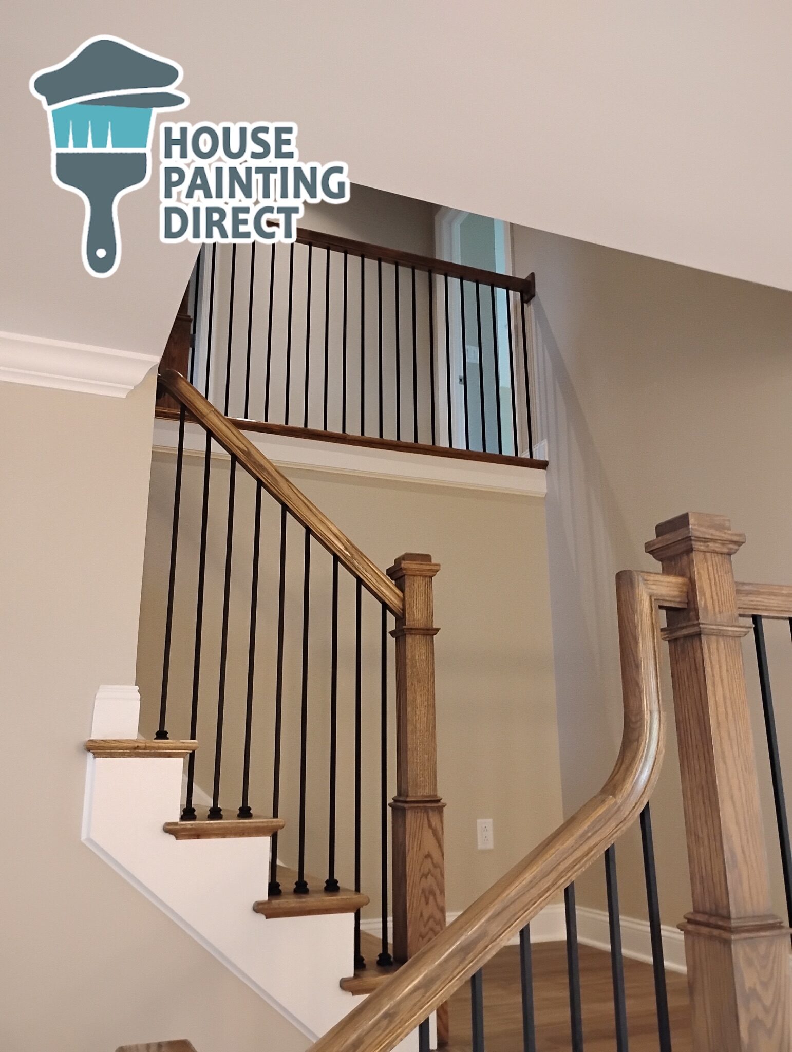
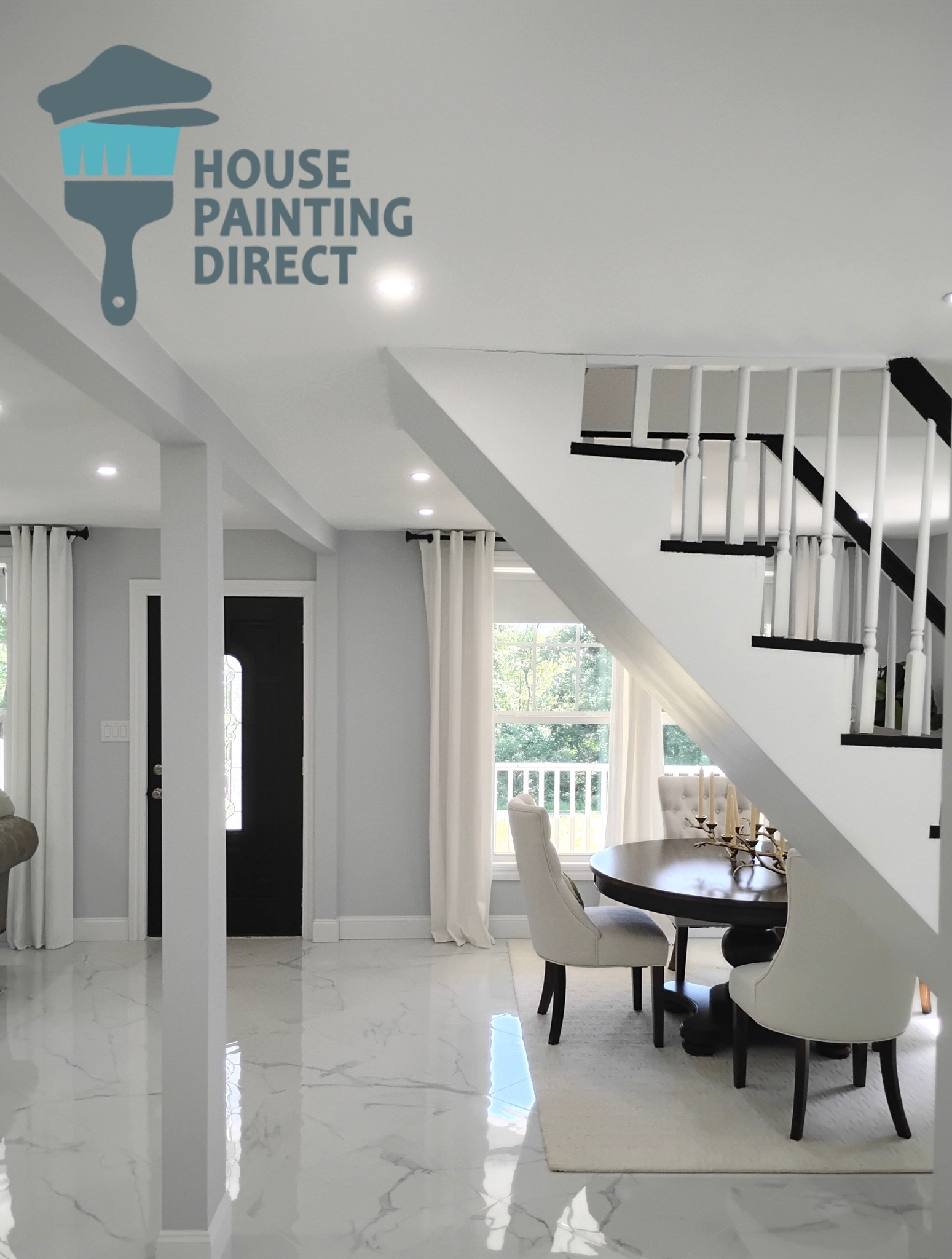
staircase interior house painting wilkes-barre

Clean Lines and Smooth Finishes Come From Technique

Professional painting tends to look quieter.

Not flashy. Just crisp.

The difference often appears in:

  • Straight cut lines
  • Smooth roller texture
  • Consistent sheen
  • Even coverage
  • Minimal lap marks
  • Proper brushwork around trim and corners

These details are usually the result of experience rather than speed.

And on older NEPA homes — where walls may not be perfectly straight and trim may have decades of layered paint history — achieving a polished finish often requires patience more than anything else.

Clean Lines and Smooth Finishes Come From Technique

Professional painting tends to look quieter.

Not flashy. Just crisp.

The difference often appears in:

  • Straight cut lines
  • Smooth roller texture
  • Consistent sheen
  • Even coverage
  • Minimal lap marks
  • Proper brushwork around trim and corners

These details are usually the result of experience rather than speed.

And on older NEPA homes — where walls may not be perfectly straight and trim may have decades of layered paint history — achieving a polished finish often requires patience more than anything else.

Professional Painters Notice Problems Homeowners Miss

One valuable aspect of experienced painters is that they spend long periods closely examining surfaces most homeowners rarely inspect carefully.

During prep work, painters often uncover:

  • Hidden water damage
  • Failing caulk joints
  • Wood rot
  • Drywall stress cracks
  • Nail pops
  • Moisture staining
  • UV deterioration

Especially in older homes throughout Luzerne and Lackawanna counties, paint sometimes becomes the first layer revealing deeper maintenance concerns underneath.

Addressing those issues early helps preserve both appearance and structural integrity long term.

Timelines Should Be Realistic

A professional painting project should not feel unnecessarily rushed.

Certain processes require time:

  • Drying between coats
  • Surface curing
  • Repair work
  • Humidity management
  • Detailed preparation

Weather can also affect exterior scheduling significantly in Pennsylvania.

Spring and fall often provide ideal painting conditions, while periods of heavy humidity or rapid temperature shifts may require adjustments to maintain finish quality.

Professionals usually prioritize lasting results over artificial speed.

The Final Result Should Feel Cohesive

When a painting project is completed well, the biggest impression is often not the color itself.

It’s the feeling that the home suddenly looks more complete.

Trim feels sharper. Light reflects more evenly. Architectural details become clearer. Rooms feel calmer, brighter, cleaner, or more intentional depending on the palette.

On the exterior, the home settles naturally into its surroundings rather than competing with them.

That cohesion is what separates thoughtful professional painting from basic color application.

A Good Painting Experience Should Leave the Home Feeling Elevated

Professional house painting is partly about protection, partly about aesthetics, and partly about stewardship of the home itself.

Especially in NEPA — where homes endure long winters, changing moisture levels, wooded environments, and decades of seasonal wear — painting becomes one of the most visible forms of long-term maintenance.

And while homeowners understandably focus on the final appearance, the true value of professional painting often comes from everything happening underneath the finish:

  • Careful preparation
  • Thoughtful product selection
  • Surface understanding
  • Environmental awareness
  • Skilled application

Those are the details that help a paint job not only look beautiful when completed, but continue looking beautiful long after the ladders are gone.

11 + 6 =